When Apple needed a color to make the new iPhone look unmistakably new, it picked burgundy. The iPhone 18 Pro’s Burgundy finish reads closer to wine or plum than to a bright red, and it’s the first time an iPhone has come in anything like it. Weddings got there first. Burgundy has anchored fall palettes for years, and this season it feels less like a safe classic and more like the color to beat. The question is no longer whether to use it, but what to put next to it. The partner color decides the whole mood, from a candlelit castle dinner to a breezy winter garden. Here are three pairings that take burgundy in completely different directions.
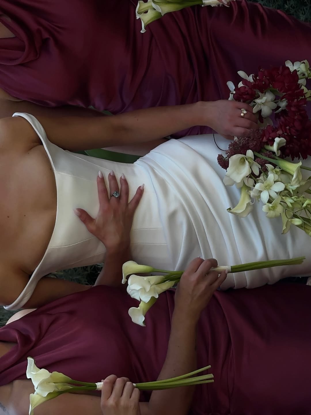
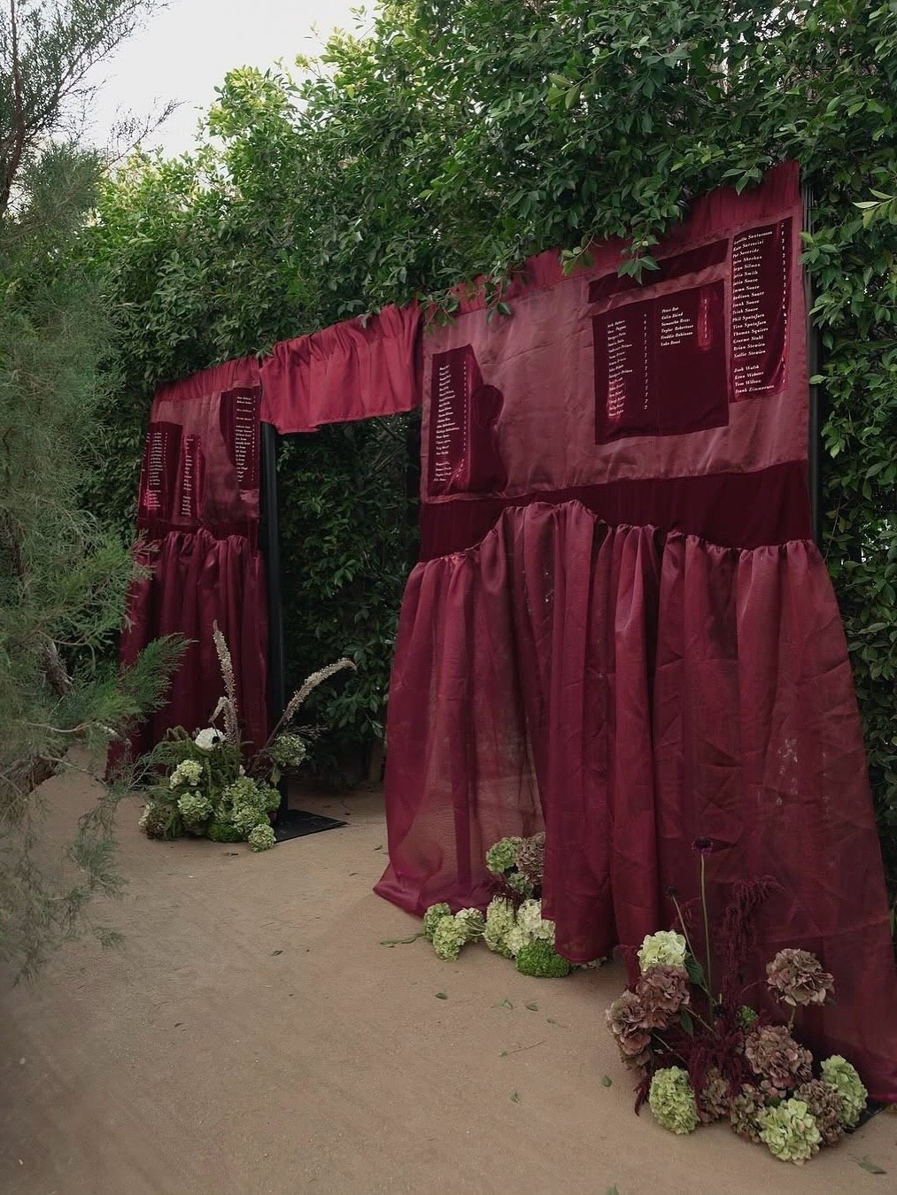
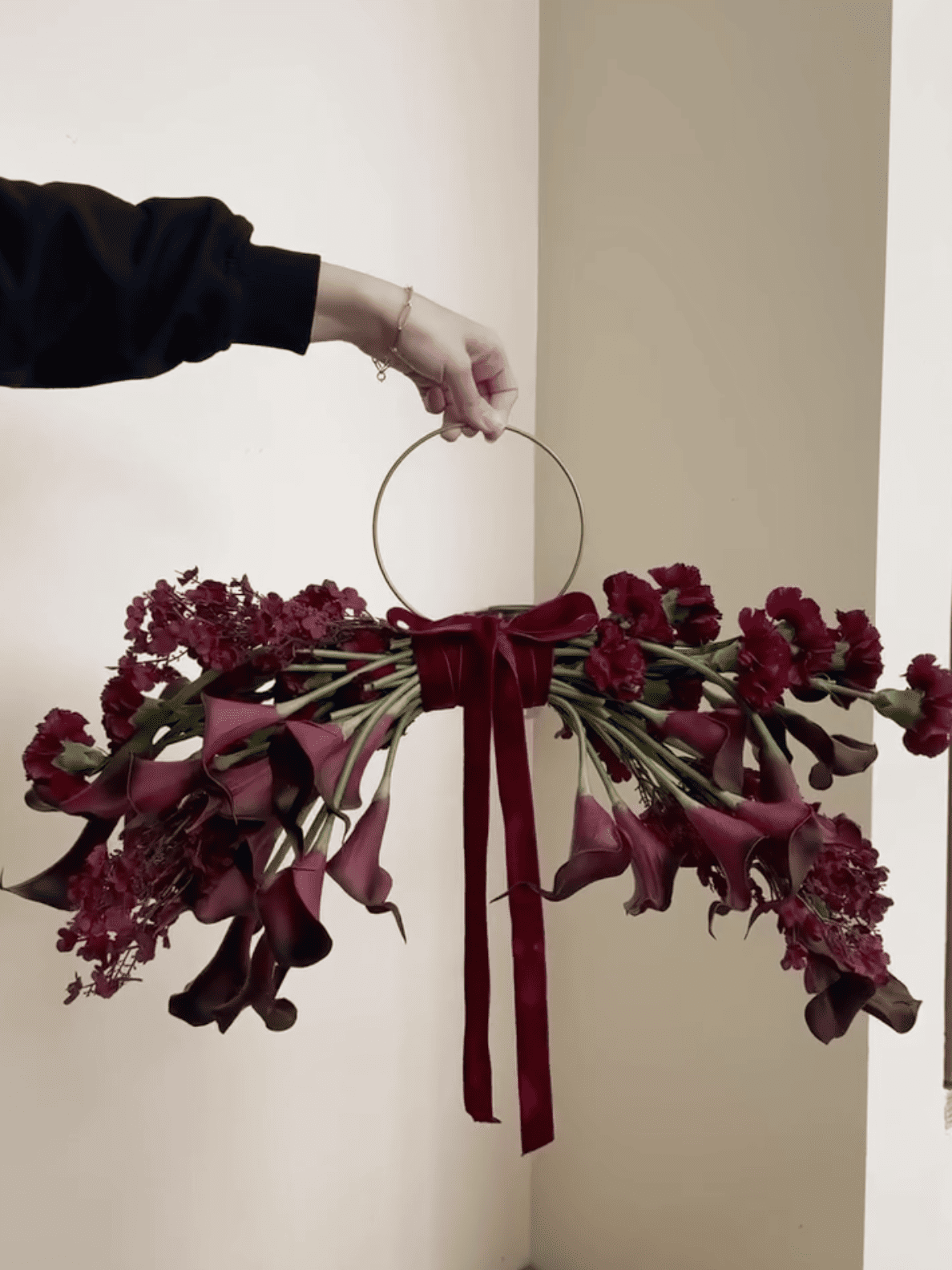
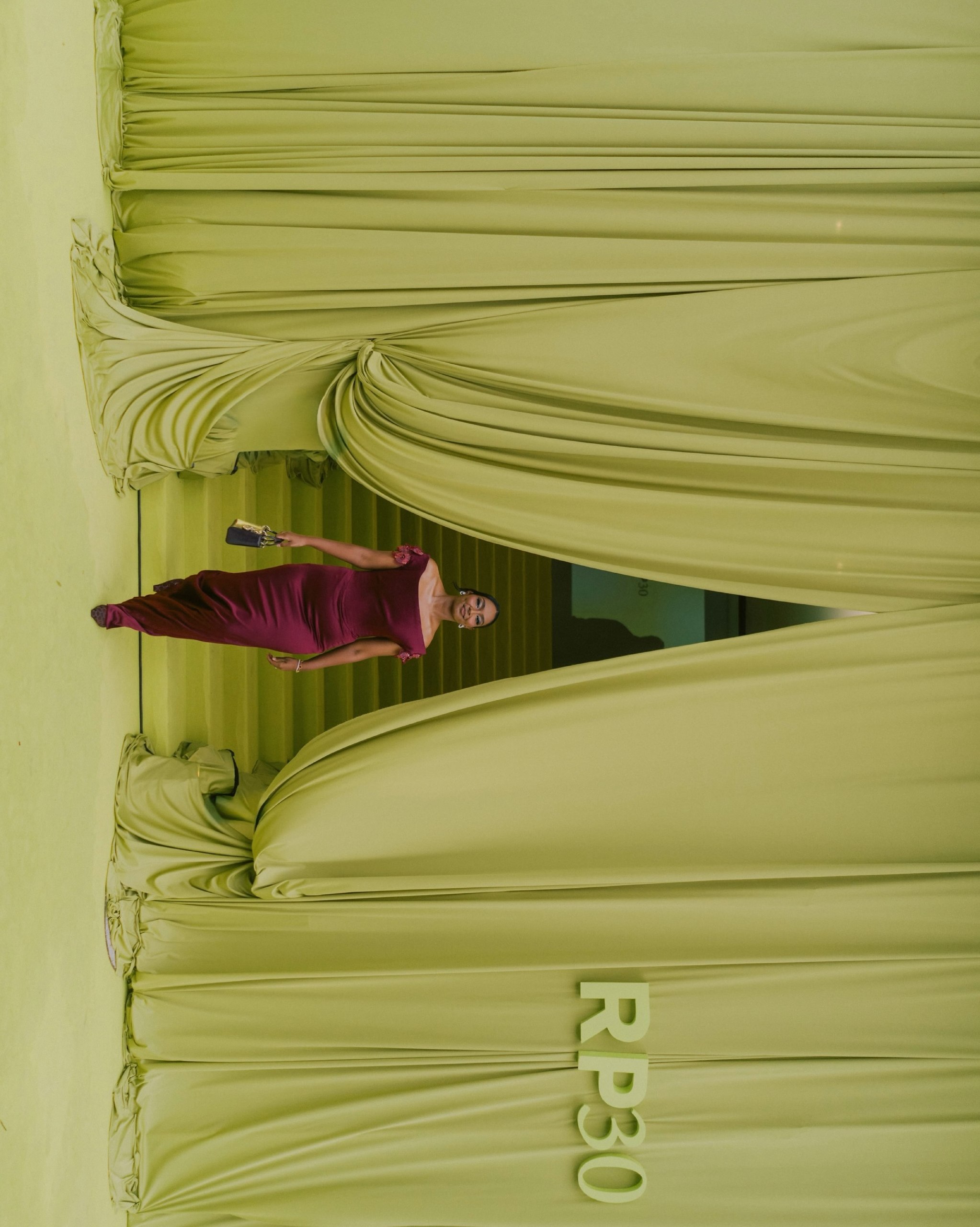
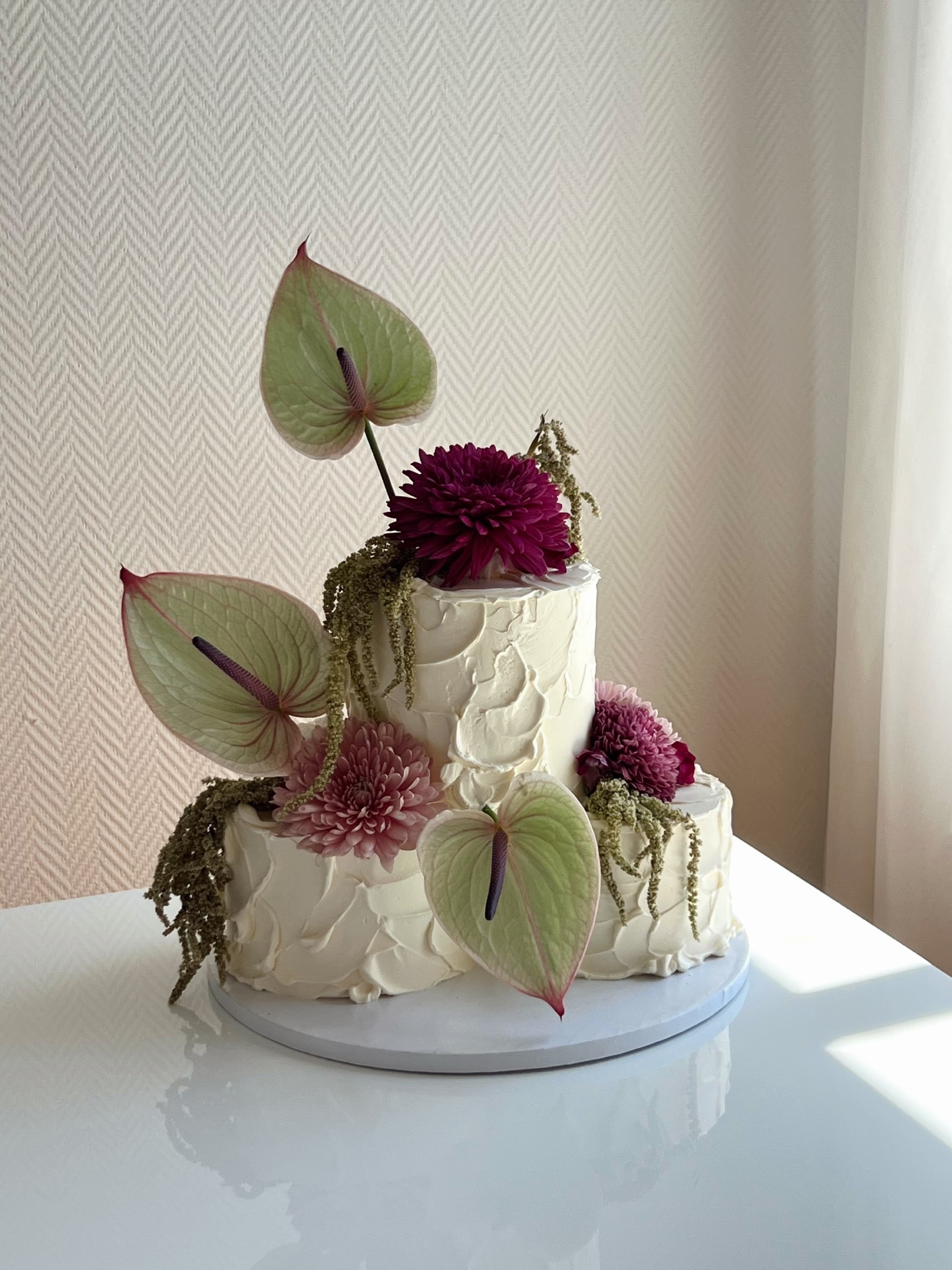
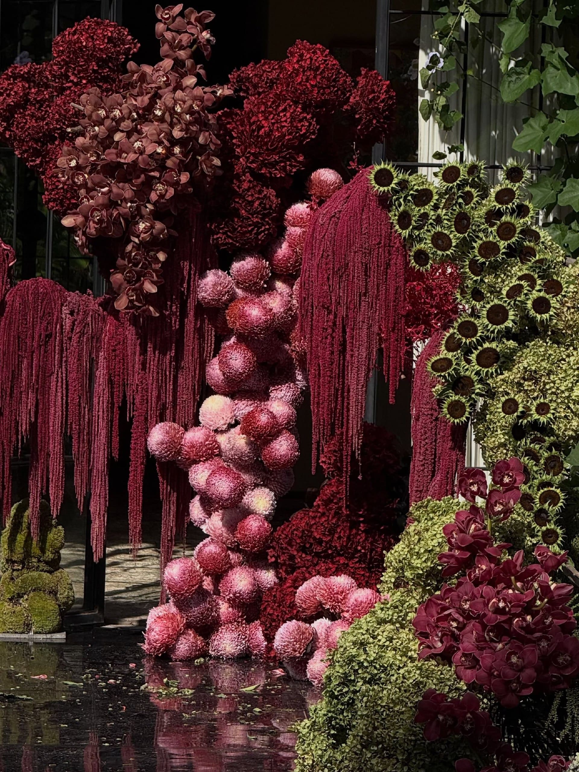
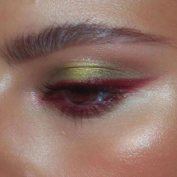
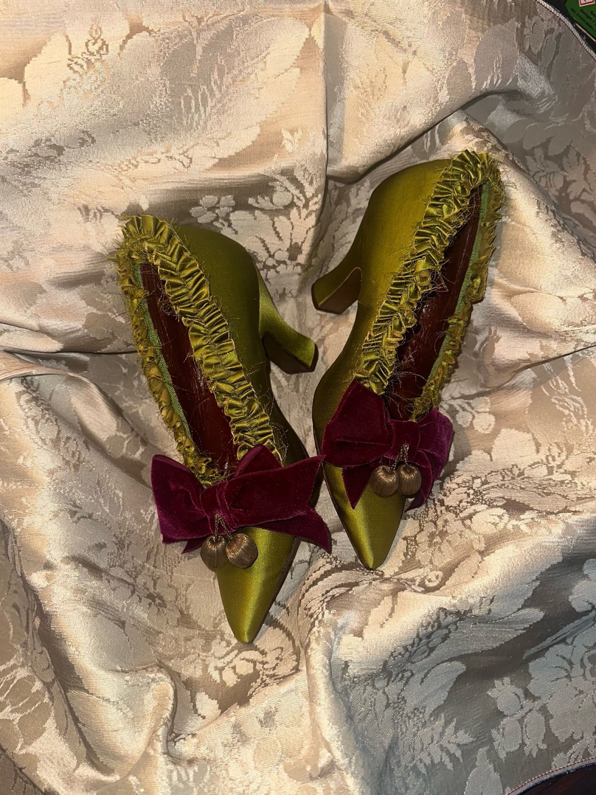
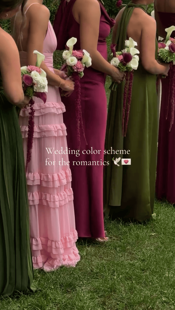
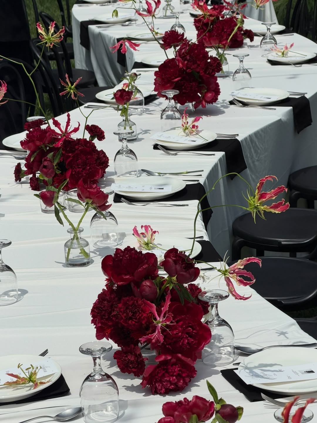
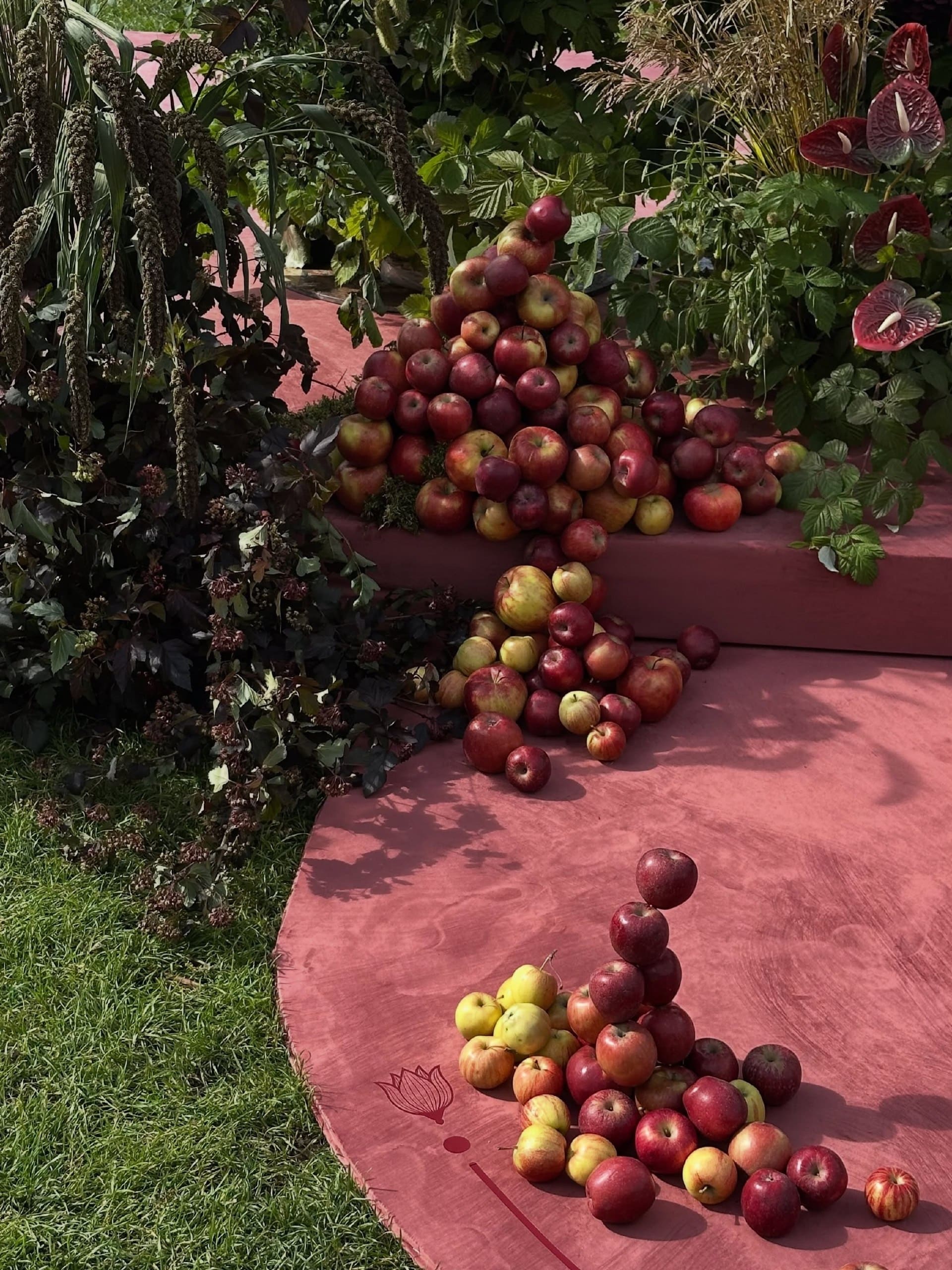
This is the pairing that feels most like fall itself. Burgundy brings the warmth, and green keeps it grounded. It gets far more interesting when the green goes lighter. Classic forest green makes burgundy look traditional, but olive or a sharp chartreuse gives it an edge that feels closer to a fashion week set than a harvest dinner. The trick is to let the two colors trade places. Burgundy can lead with the flowers and the bridesmaid dresses, while green slips in through a cake detail or a pair of shoes. Or flip it, wrapping the room in soft green fabric so burgundy blooms pop against it. Keep a little white in the mix, through calla lilies or crisp linens, and the palette stays fresh rather than heavy.
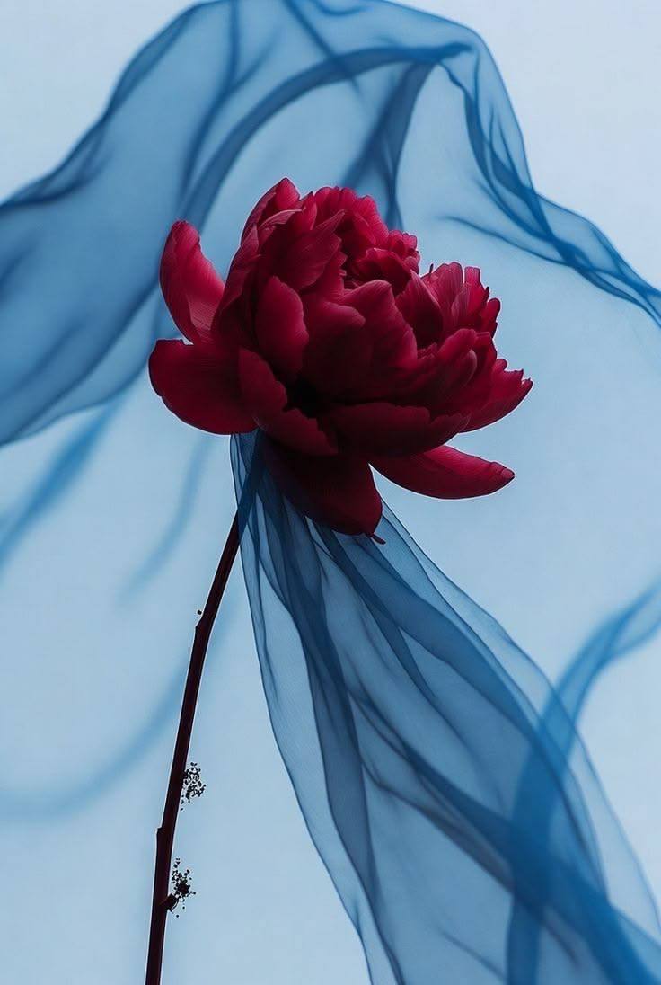
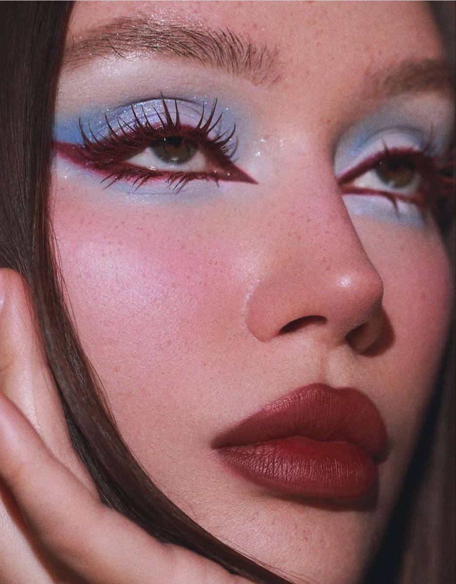
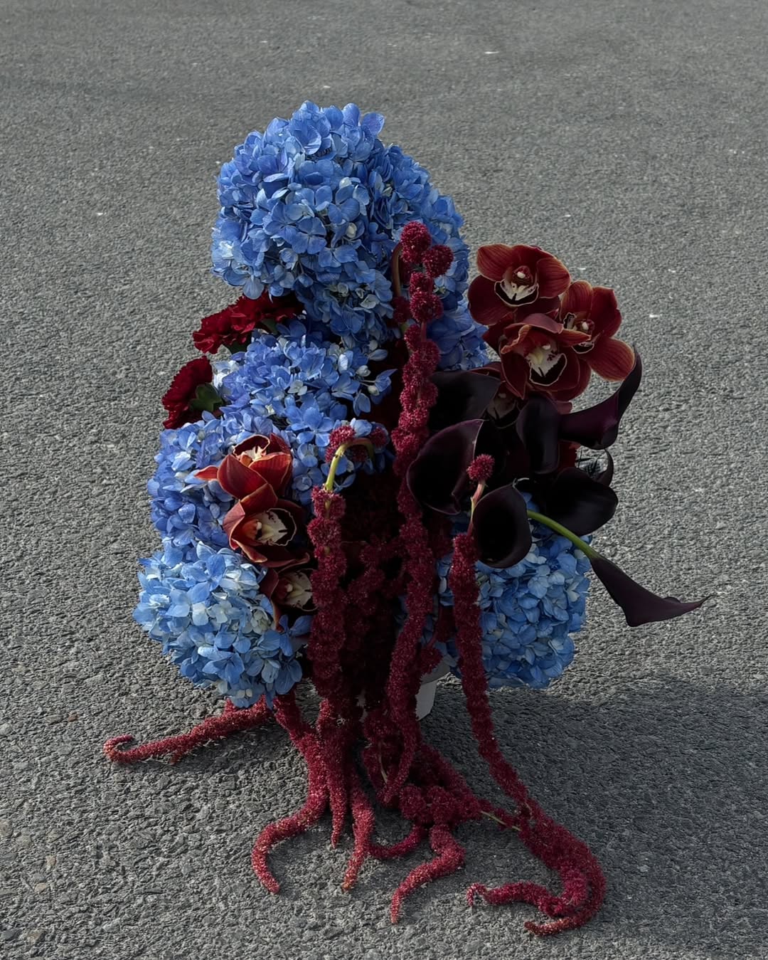
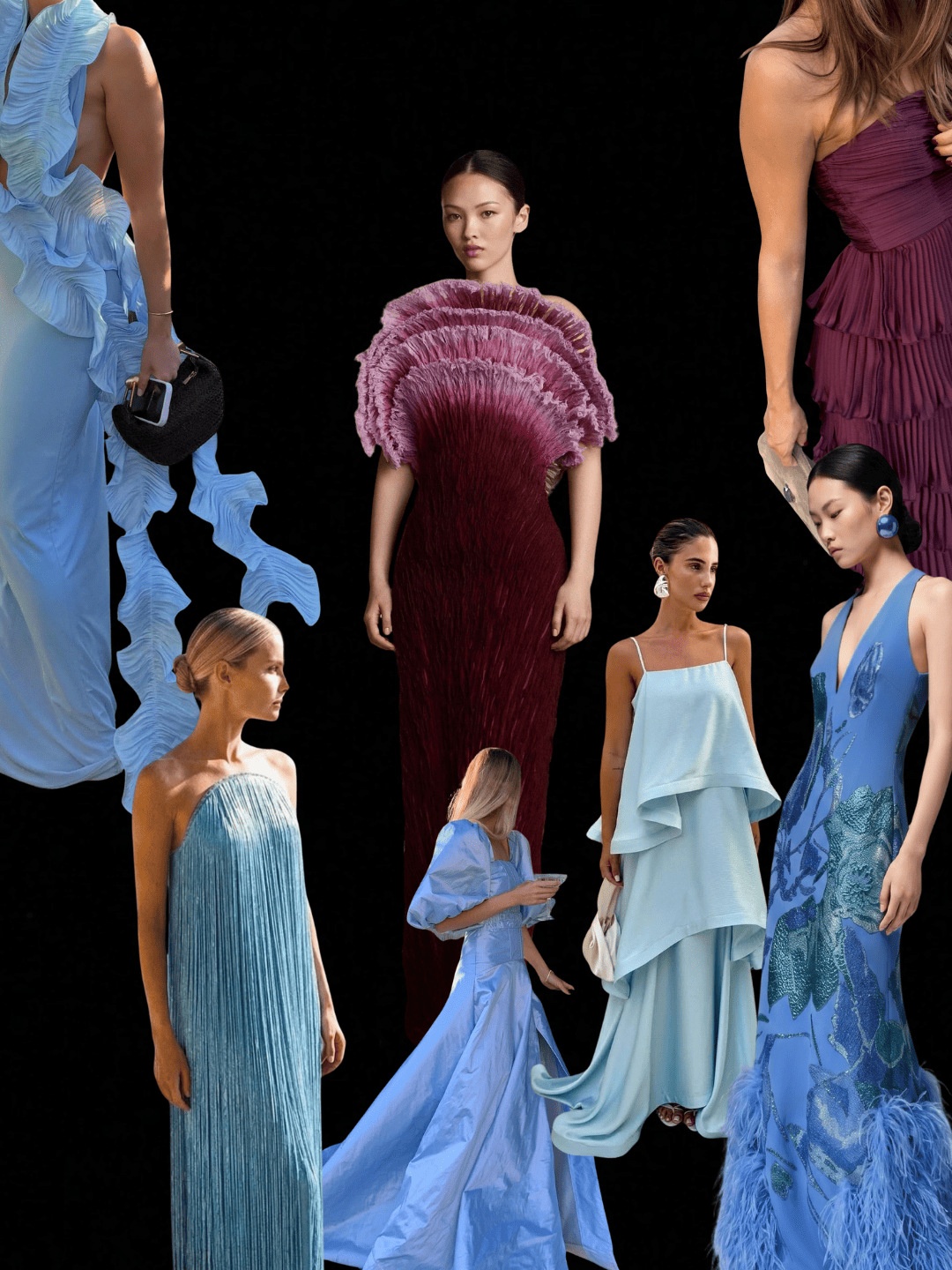
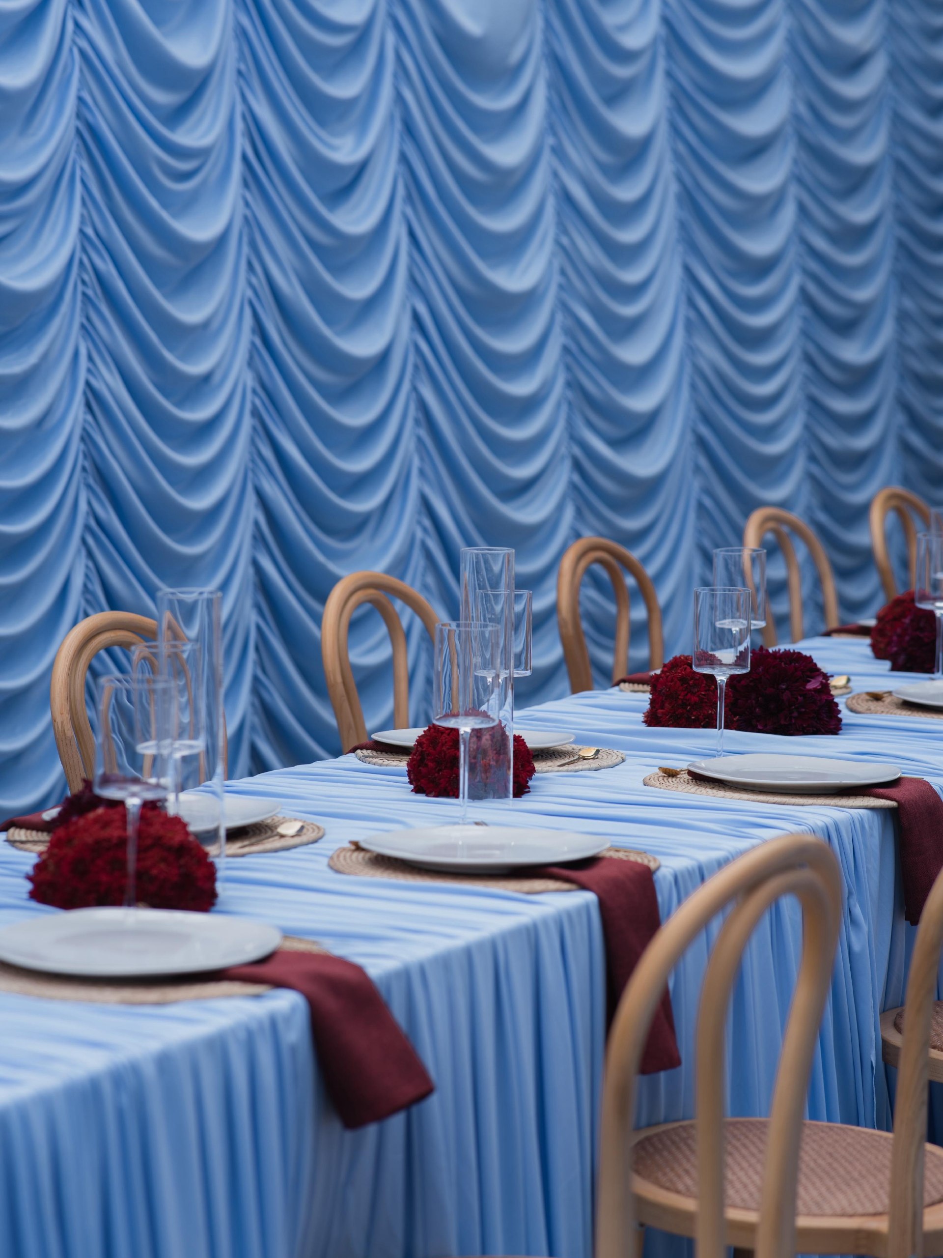
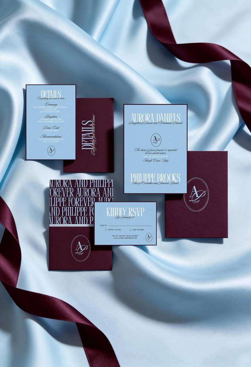
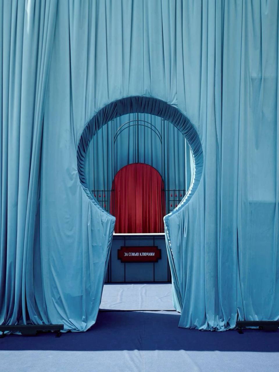
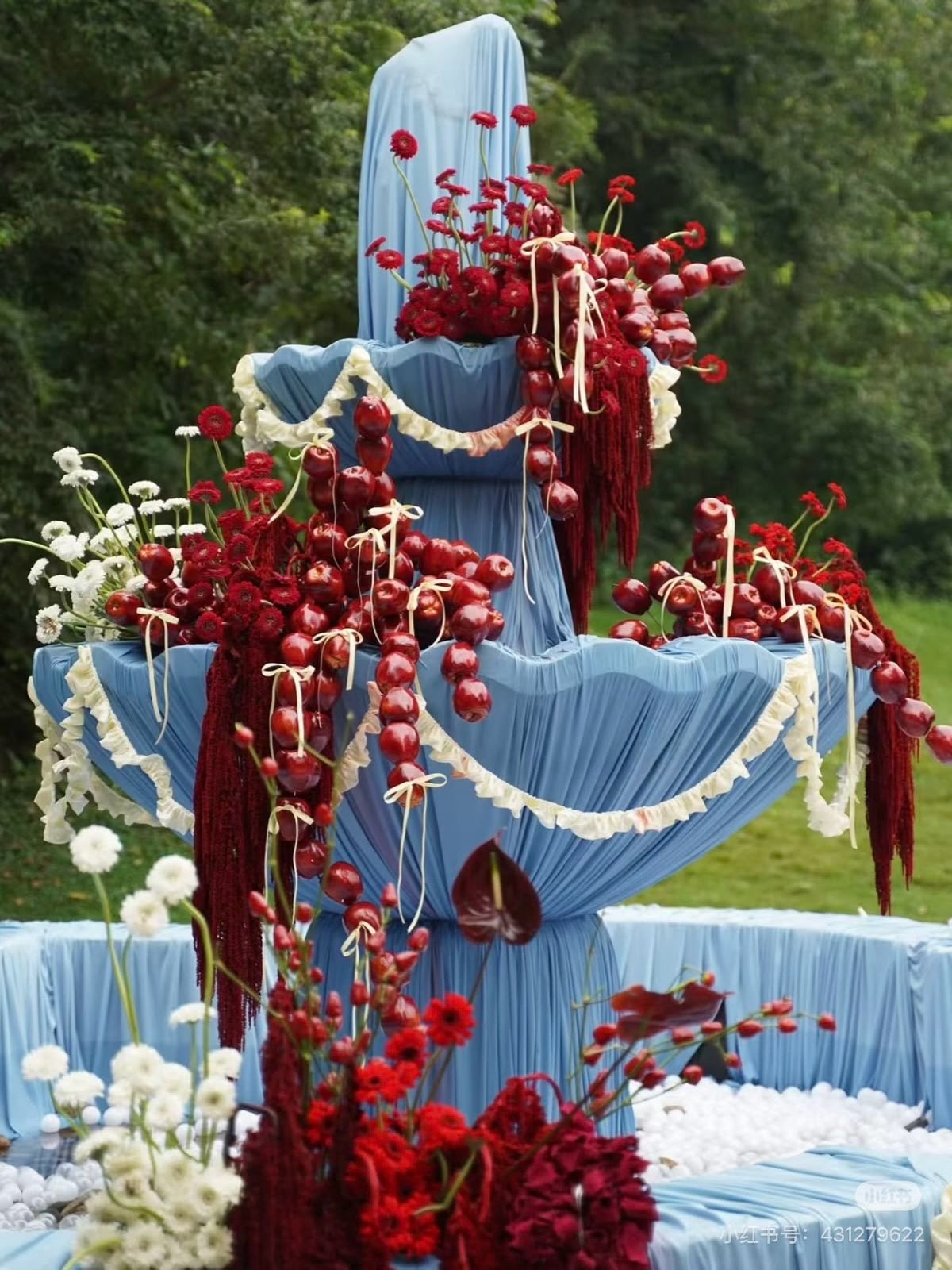
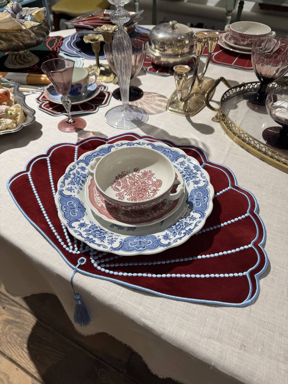
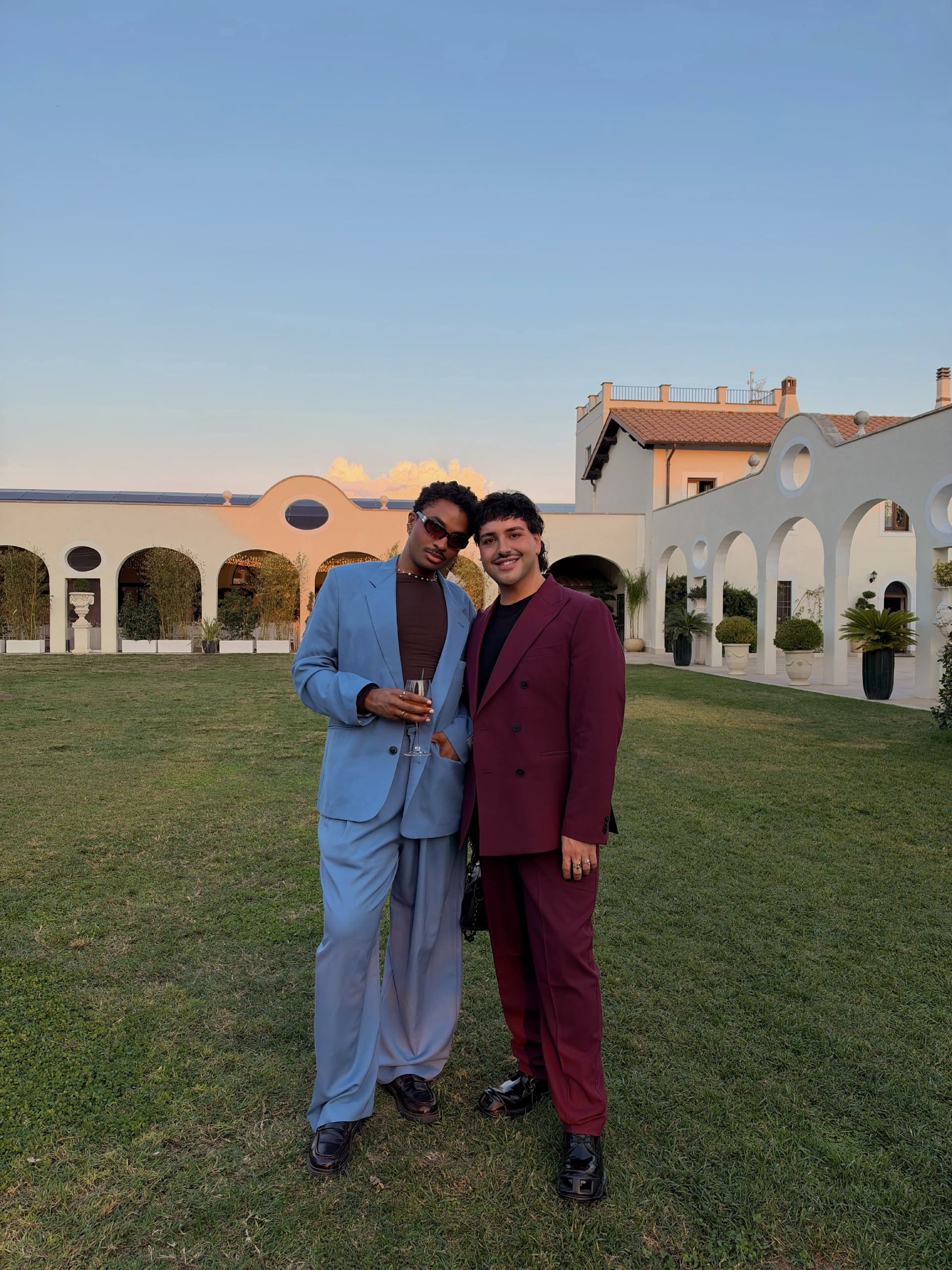
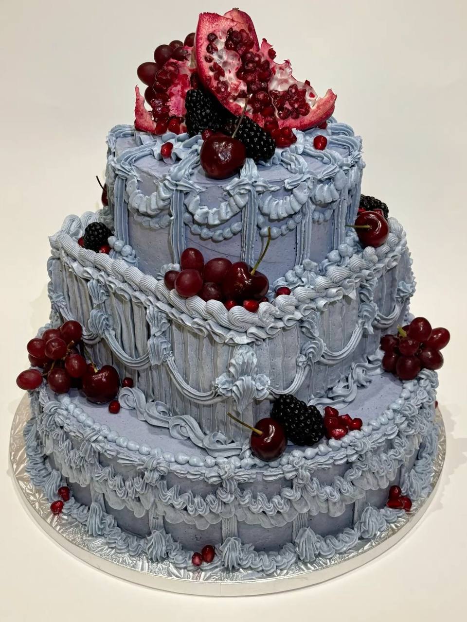
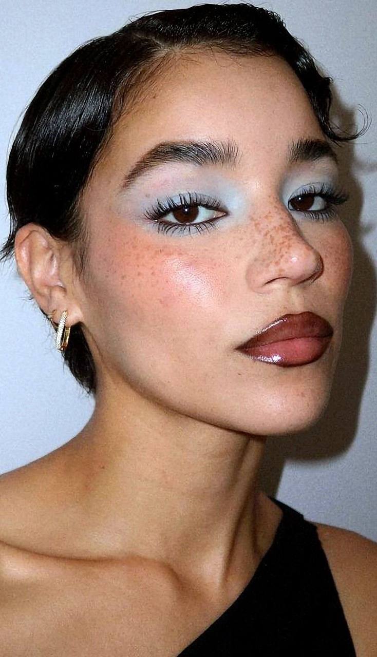
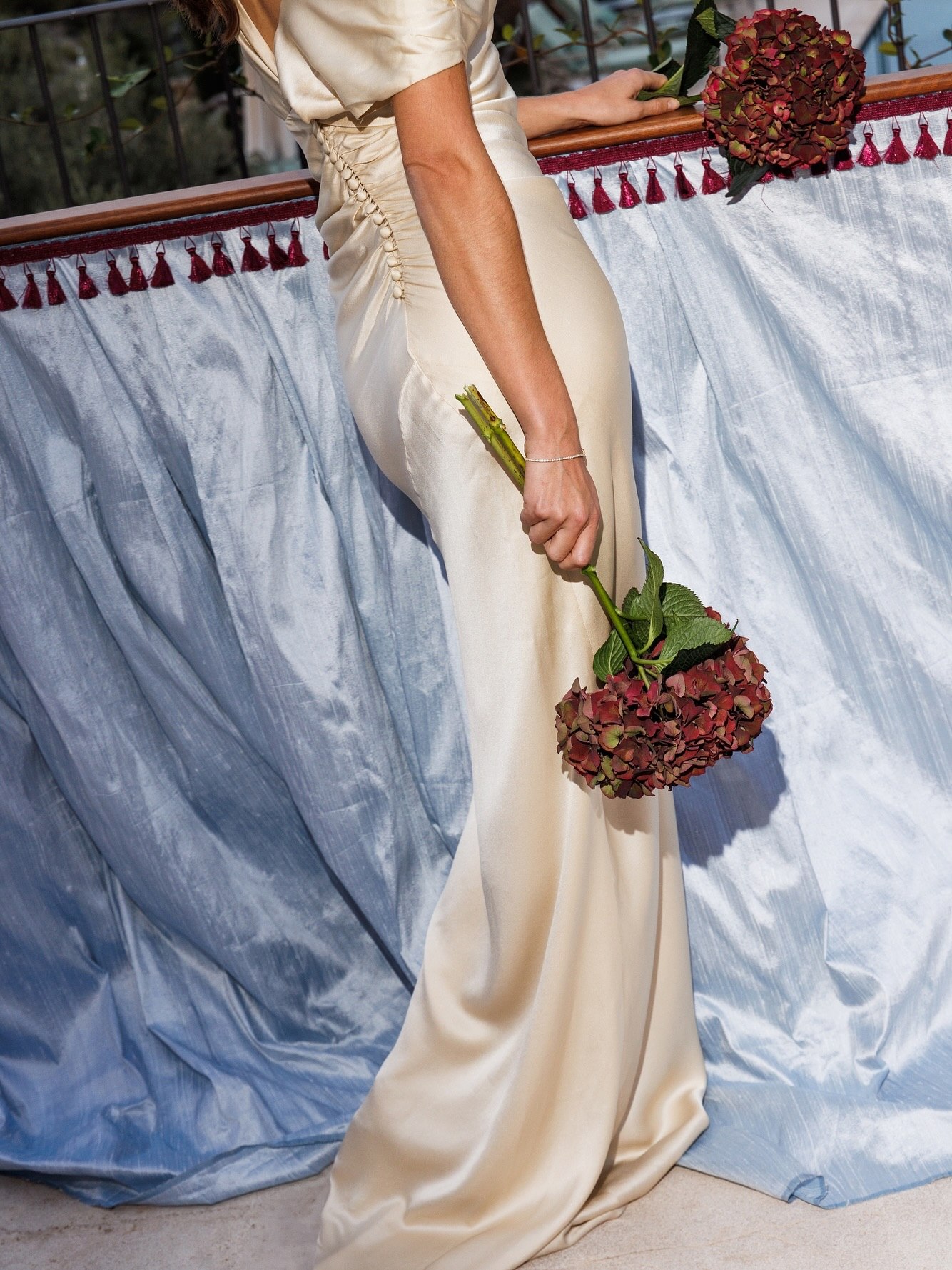
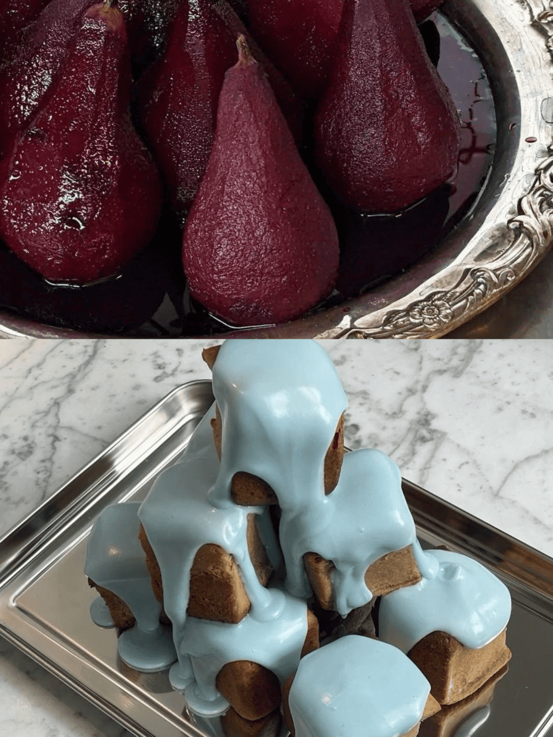
Warm meets cool here, and that tension is the whole point. Burgundy is deep and saturated, while ice blue is cool and airy, so each one makes the other look richer. The most striking version uses blue generously as the backdrop and saves burgundy for concentrated hits of color. Picture a room softened with pale blue fabric, then a few dark blooms and wine-red napkins pulling the eye exactly where you want it. The same balance works in the details, from invitations tied with a deep red ribbon to a powder blue cake crowned with dark fruit. It even suits the menswear, with one suit in each color. In a fun coincidence, Apple seems to agree, since the other new iPhone 18 Pro color is Glacier, a pale icy blue.
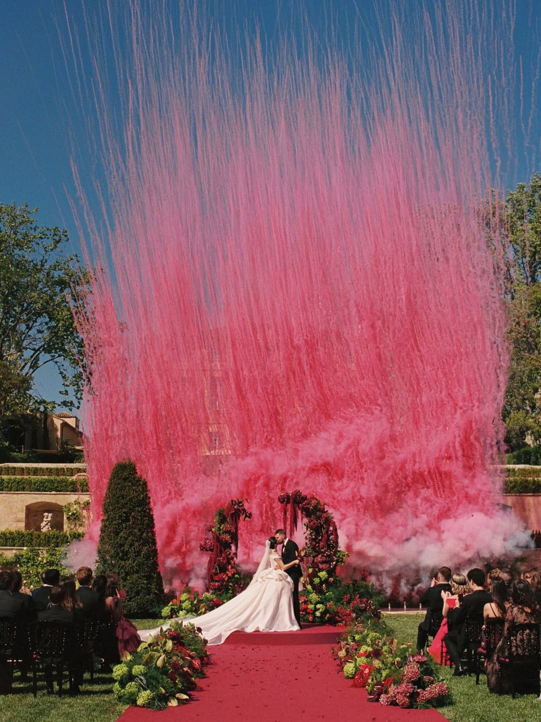
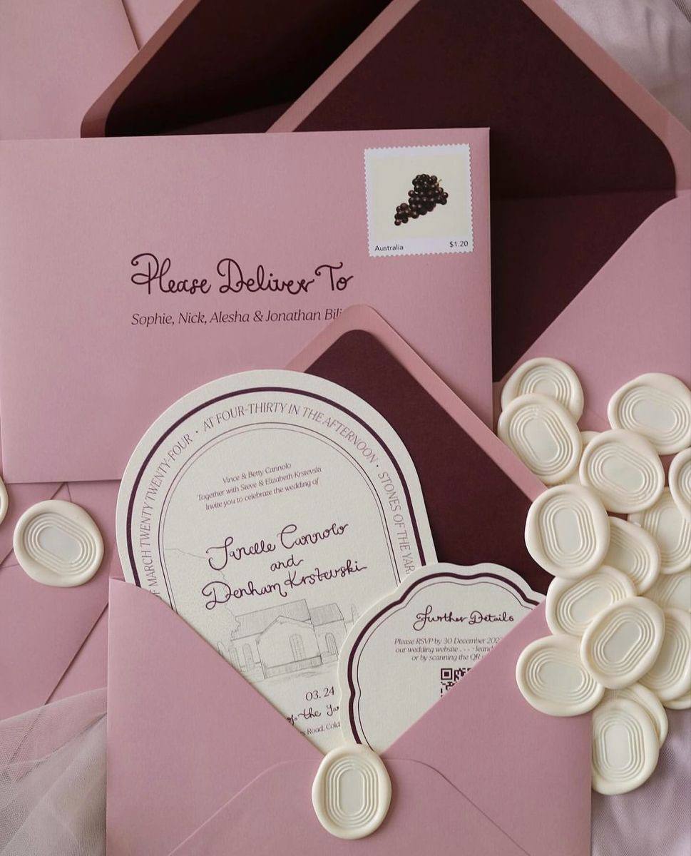
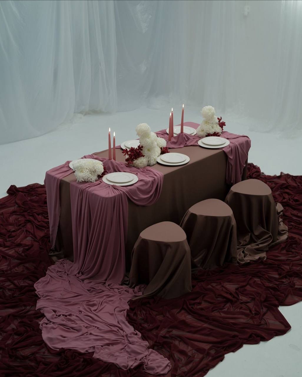
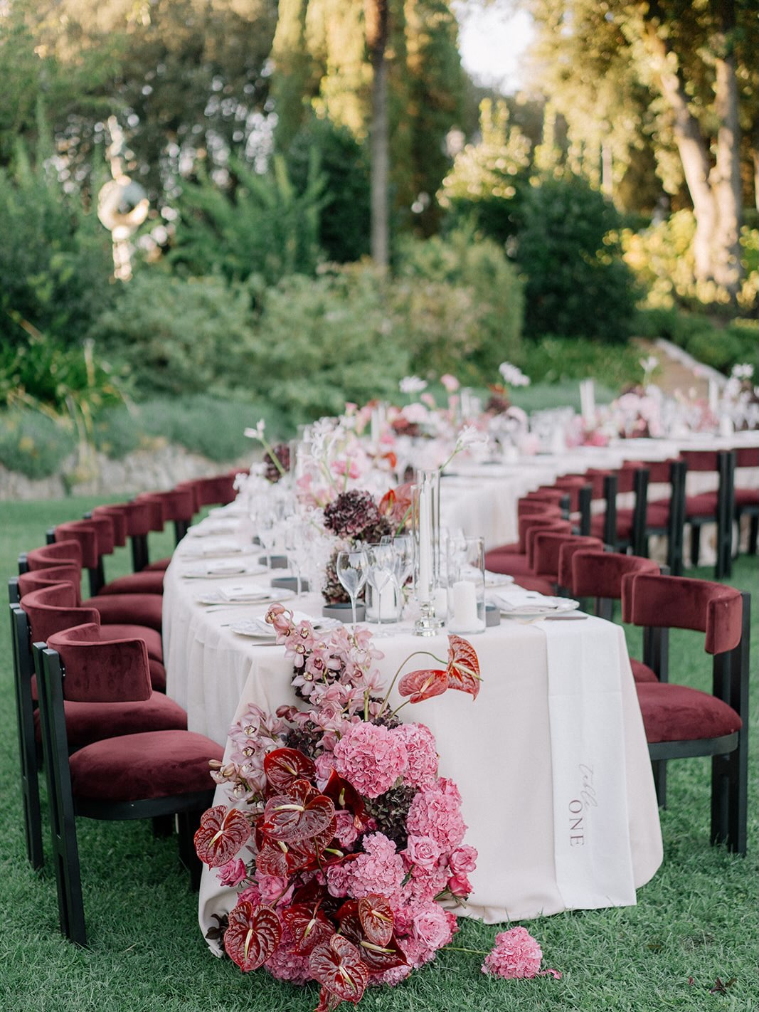
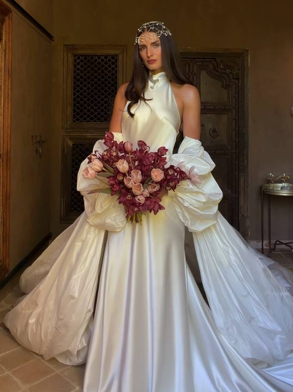
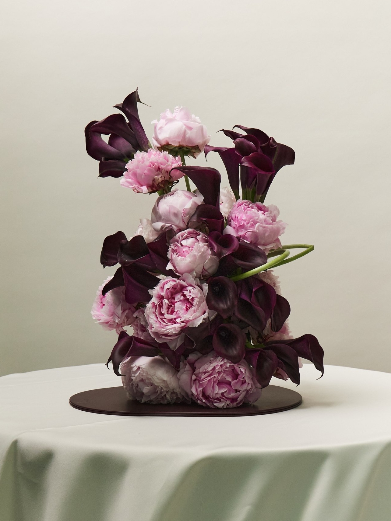
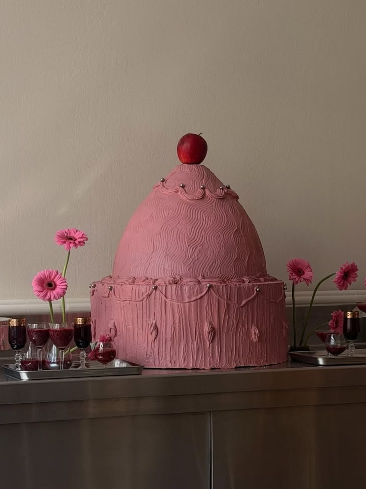
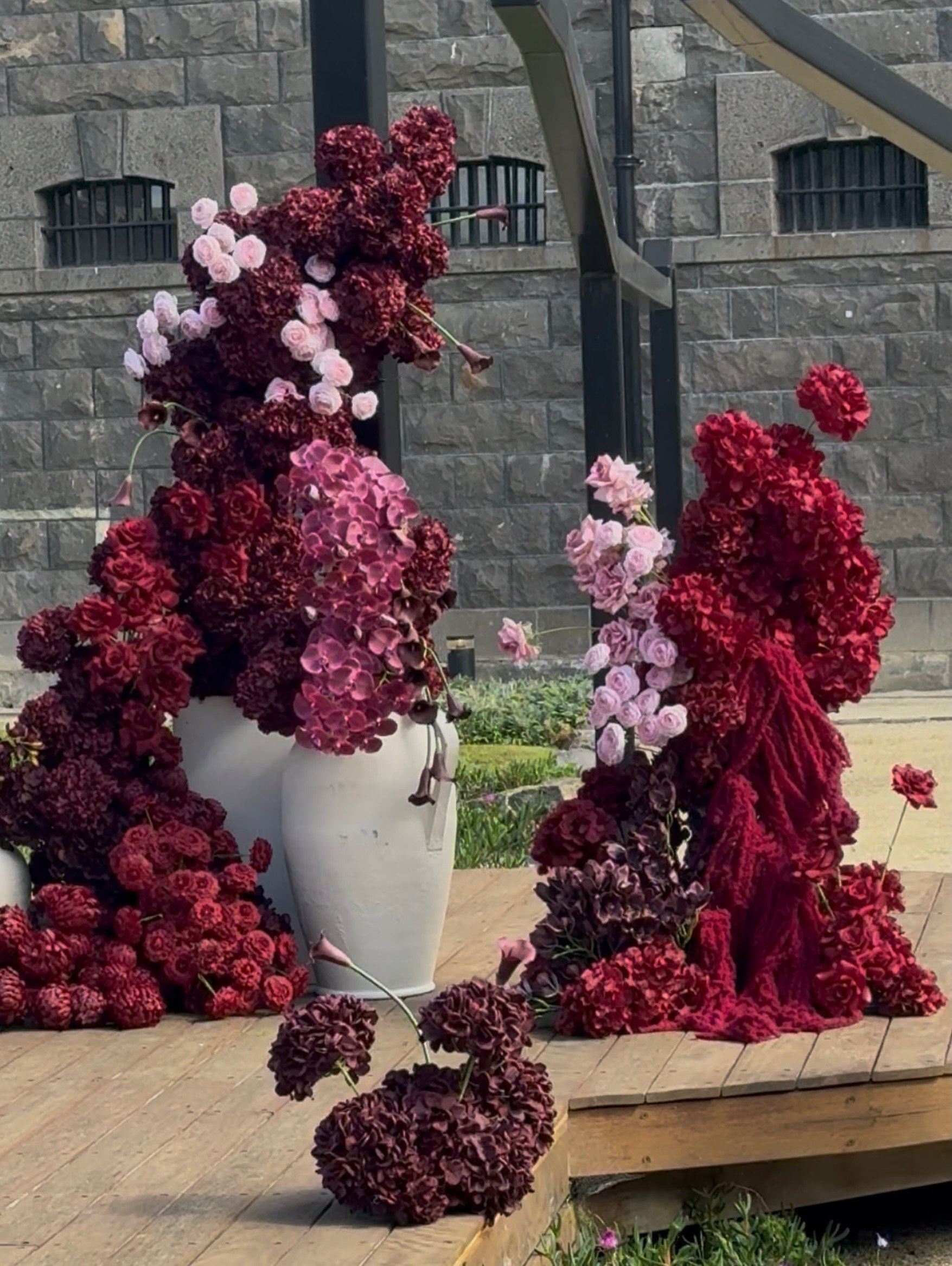
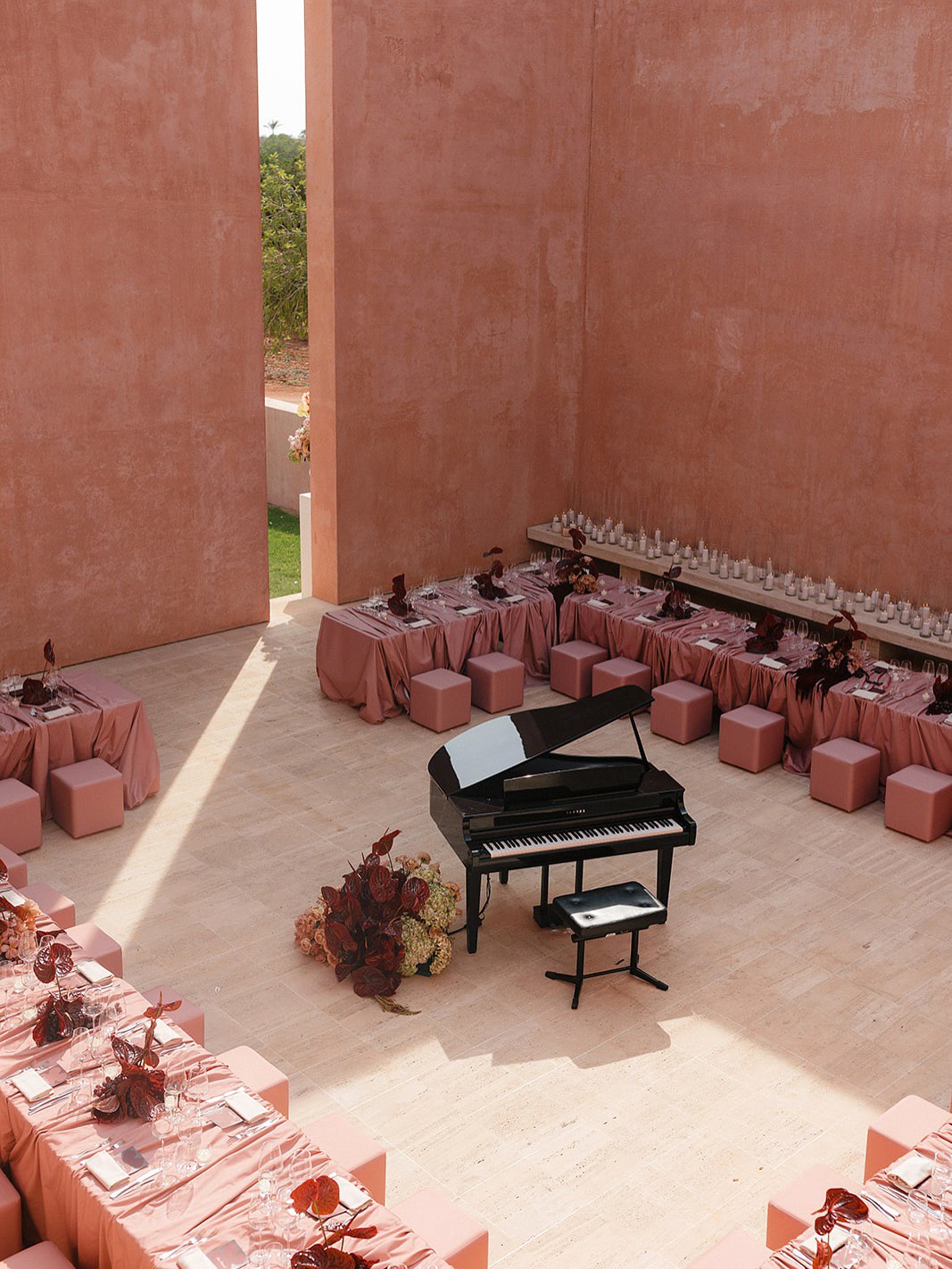
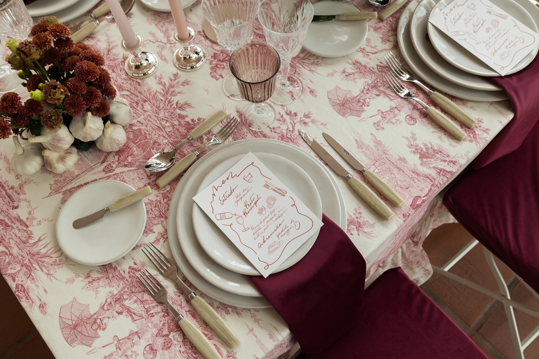
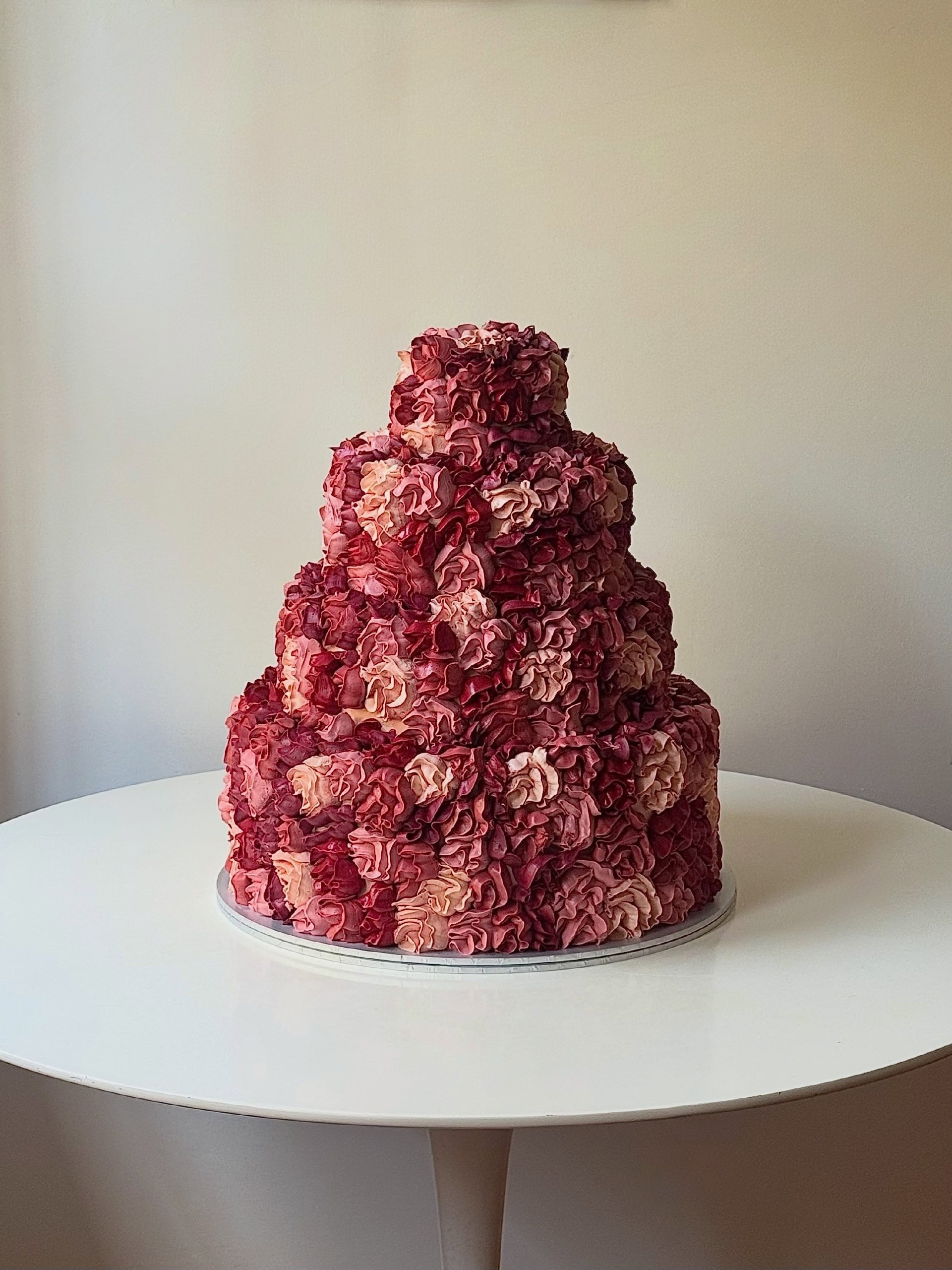
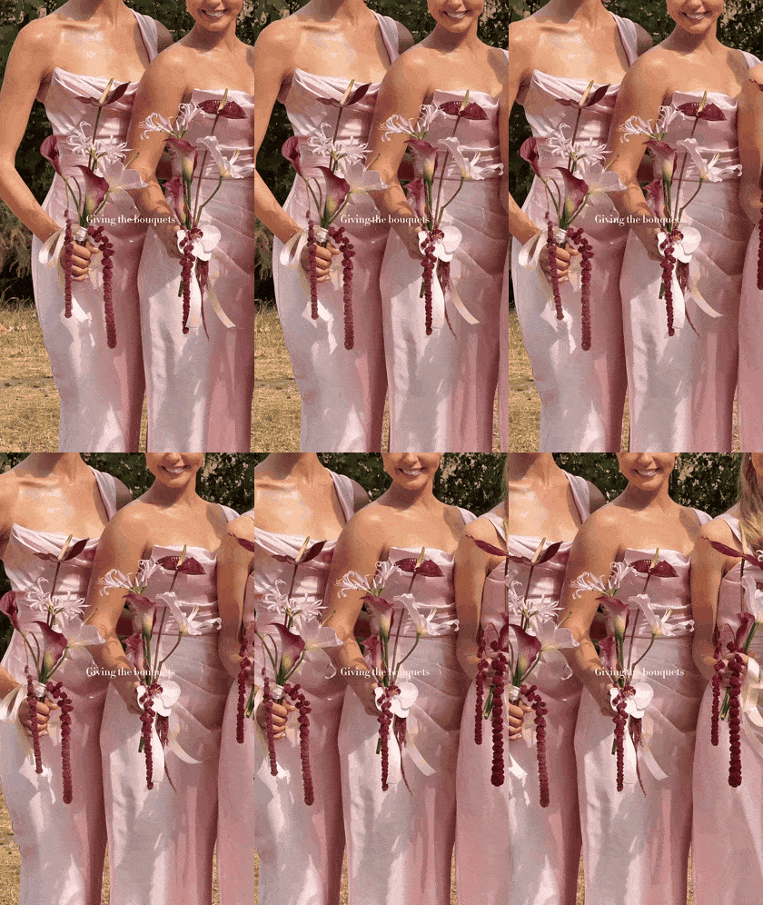
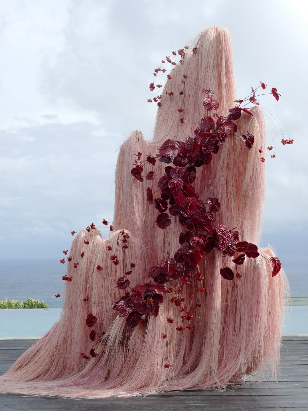
If burgundy feels too dramatic on its own, pink is the softener, though the sweetest baby shade rarely works here. Dusty rose and mauve read more grown-up, and they turn burgundy into the deepest note of a single tonal palette rather than a separate color. That’s what makes the pairing feel so modern. Instead of two blocks of color, think of a gradient that runs from blush linens and pale peonies all the way to wine-dark calla lilies and velvet chairs. Texture does a lot of the work, so pair soft satin with plush velvet. Even the cake can join in, whether it’s piped in deep red roses or finished in a single rosy shade with one dark cherry on top.