Wuthering Heights unfolds like a curated Pinterest board assembled from a thousand details. Some viewers are completely obsessed, and others feel deeply unsettled. Either way, if you treat it like a bespoke universe, you will suddenly have something much more wedding-relevant: a blueprint for building your own aesthetic world. That is exactly why it lands for brides. A wedding is also a controlled fantasy that you build in public. You choose what century your flowers are flirting with, you choose what kind of romance you “believe in,” and you decide how much realism you want in the final cut.
We suggest pressing play on Charli XCX’s Wuthering Heights album, written for the film, and taking a walk across the misty moors with us. We can’t promise you’ll meet your own Heathcliff in the fog the way Cathy once did, but we can promise you a new dose of inspiration.
Emerald Fennell’s Vison
The movie was directed by Emerald Fennell, the filmmaker behind Saltburn, after which many of us genuinely needed a minute to recover. Fennell’s most important rule is that memory is allowed to be messy. She says, “I can’t say I’m making ‘Wuthering Heights.’… What I can say is I’m making a version of it,” and she explains that her version includes what she remembers, what is not real, and what she wanted to happen.
Fennell treats aesthetics like LEGO. Your wedding can be a world where Victorian mourning jewelry, mid-century melodrama, and 2026 red-carpet corsetry all coexist, because you made the rules. In other words, Emerald is literally creating her own universe. The second key is permission to go too far. In many interviews, the director and actors describe the atmosphere as maximalist: it is an intentional pressure on style to the point where it becomes “too much,” and that precise edge is where they find it interesting.
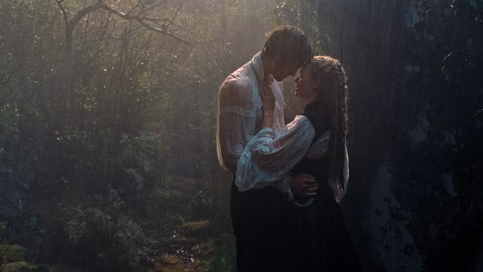
Photo: Courtesy of Warner Bros.
The Looks That Made Us Gasp
Costume designer two-time Oscar winner Jacqueline Durran, who created 45–50 costumes for Cathy alone, with overlaps and reuse, framed the wardrobe as stylised rather than time-accurate. Instead of choosing an era and staying loyal to it, the team chose emotion first and treated centuries like a wardrobe to pull from. A silhouette might lean Regency, a textile might reference Victorian codes, a detail might feel unmistakably modern, but the emotional throughline keeps everything coherent.
It would have been very easy for all of this to feel disjointed, even alien, next to each other. The styling takeaway we can borrow from this film is simple: let one motif run through every detail so the entire world holds together. The dress speaks to the braid, the braid mirrors the jewelry, and the jewelry reflects the space around it, so nothing feels accidental, even when the references technically shouldn’t coexist.
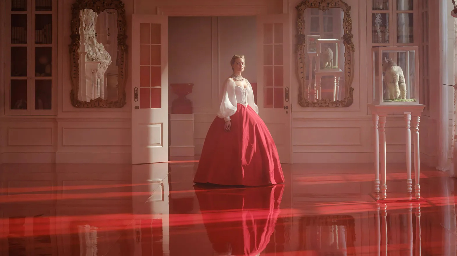
Photo: Courtesy of Warner Bros.
Wedding Gown
Let’s not overbuild the suspense and start exactly where we all wanted to start: the wedding dress. The silhouette draws on late Victorian portrait references: an off-the-shoulder neckline, softly structured puff sleeves, and a pleated skirt. From afar it reads traditional. Up close, the fabric tells a different story. There’s a subtle sheen running through it. That gloss gives Cathy an almost ghostlike quality, which feels intentional.
The veil is organza, not tulle, and that choice matters. Organza appears throughout the film in different colors and textures, and here it creates movement. You can see rose motifs embroidered across it. The headpiece sits on top of the veil and secures it, not hiding underneath. Its floral elements are slightly staggered, some petals placed forward, others back, creating a subtle three-dimensional effect.
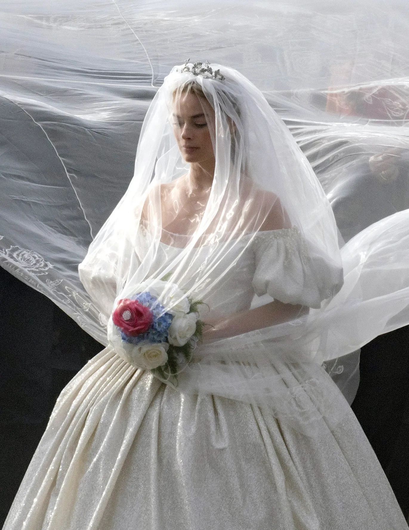
Photo: Courtesy of Warner Bros.
Cathy As a Gift
In wedding night look organza is used openly, and because of the color and the iridescent finish, it delivers a completely different vibe. Instead of bridal white and quiet glow, we get blush, peach, and almost oil-slick reflections that change with the light. The neckline is softer, framed with airy ruffles, and the waist is cinched with an oversized sash that reads very literally.
The designer has explained that the idea was to present Cathy as a gift, and that the bow makes the metaphor obvious. It quickly became one of the most discussed looks from the film. While many viewers found it divisive and read it in very different ways, it has been noted in interviews that this was Jacob Elordi’s favorite Cathy look.
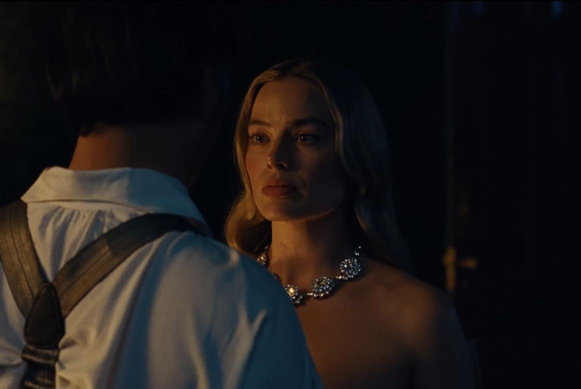
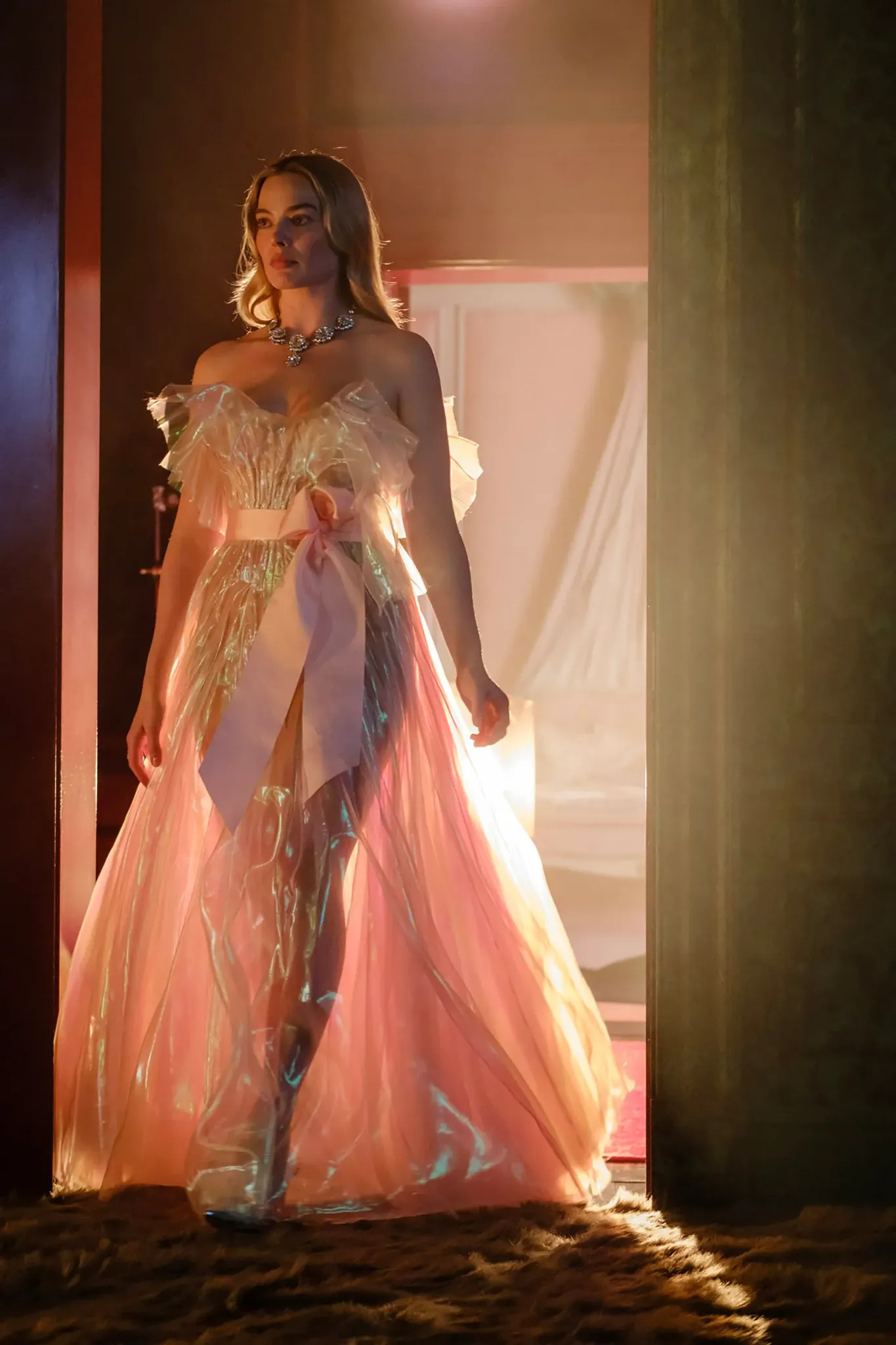
Photo: Courtesy of Warner Bros.
The Picnic Look
Let’s talk about the picnic look, because this is where the film briefly flirts with Marie Antoinette energy. The dress leans whimsical, slightly infantile in that very calculated way. The polka-dot fabric softens the mood, giving it that countryside fantasy vibe, but the construction still keeps it within the film’s controlled aesthetic universe.
And then the hat. Oversized, dramatic, completely impractical in the best way. The wide brim feels almost theatrical, and those gold falling-star appliques stitched across it add that surreal, slightly decadent twist. The red ribbon tied around it cuts through all the softness and anchors the look back to the film’s recurring red motif.
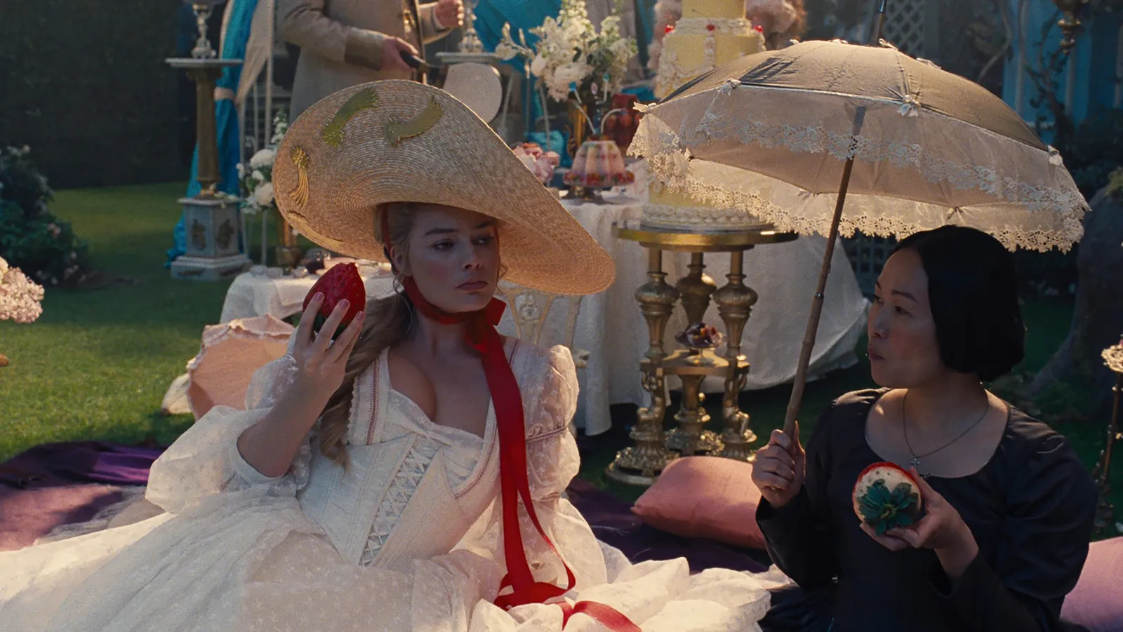
Photo: Courtesy of Warner Bros.
A Swiss Girl from Interlaken
Ironically, the only truly history-referenced outfit in the entire film is the one inspired by Franz Xaver Winterhalter’s A Swiss Girl from Interlaken. Not history-accurate to the novel’s world, but accurate to an actual visual moment that existed. Jacqueline Durran has spoken about being drawn to that sharp contrast of white against black velvet, and especially to the addition of chains layered over the bodice.
And the chains are not subtle. In a story built around obsession, possession, and emotional captivity, chains are doing heavy metaphor work. Even in the soundtrack, the phrase Chains of Love appears, reinforcing that visual thread.
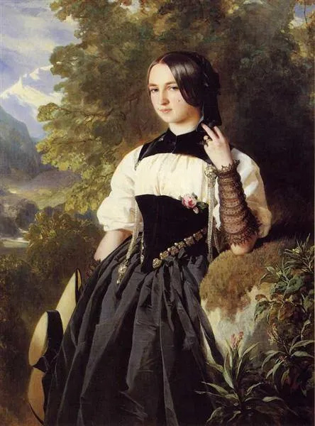
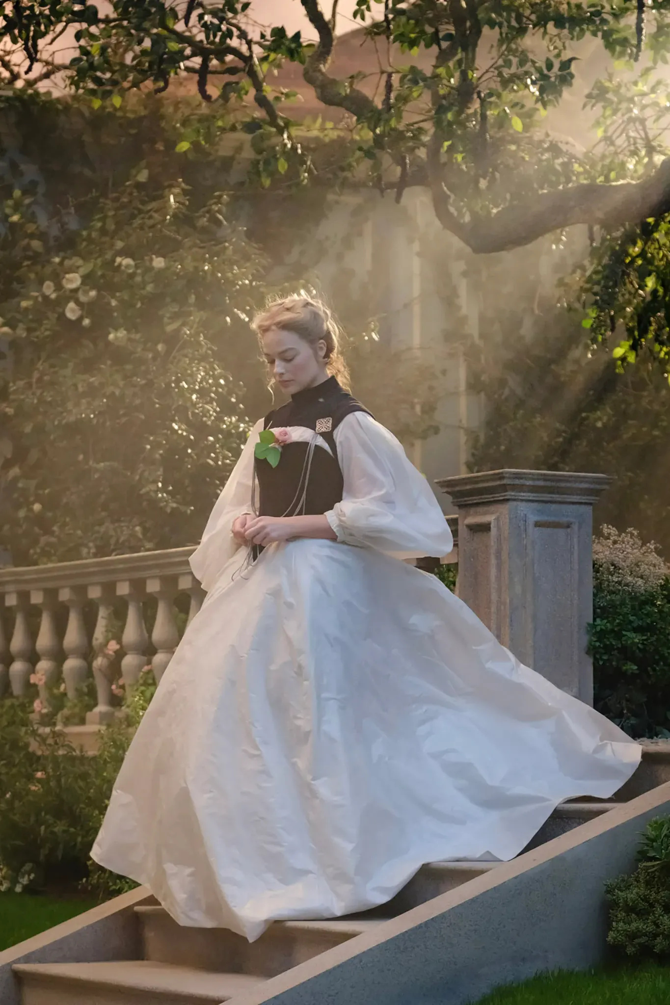
Photo: “A Swiss Girl from Interlaken”, Courtesy of Warner Bros.
Now to the Moonlight dress, which feels like the direct antithesis of the wedding gown. If the bridal look was white, luminous, almost spectral, this one goes full blackout. It’s black organza, but from a distance it reads almost like latex. That glossy surface catches the light in a way that feels slick, reflective, slightly dangerous. Only when you look closer, it behaves like liquid, like oil on water.
The cut is rooted in period construction, while the material pushes it into something modern and confrontational. And a quiet shoutout to the lighting team here. The warm yellow chandelier glow against the cooler blue tones in the scene amplifies every reflection on the dress, turning the fabric into a surface that reacts to light like a living thing.
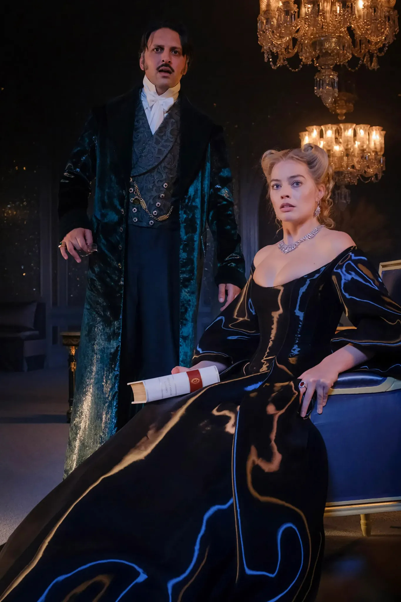
Photo: Courtesy of Warner Bros.
Winter Arc
If the bridal dress played with glow and softness, here the silhouettes become heavier, sharper, more declarative. The winter scenes introduce a completely different fashion language. Take the red cape. It’s velvet, saturated, almost lacquered scarlet, and if you look closely there’s a subtle sheen running through it. She wears it when returning to her childhood home, and the energy is nothing like Little Red Riding Hood.
The white Christmas look shifts again but keeps that density. The gown holds volume, the fabric catching blue light in a way that makes it look almost frozen. Then there’s the fur hat, unmistakably Russian-core in mood, structured and slightly severe, adding a northern aristocratic note to the silhouette. The movie is full of winter wardrobe codes, layers, and textures that actually look warm, and that is something worth noting for winter brides.
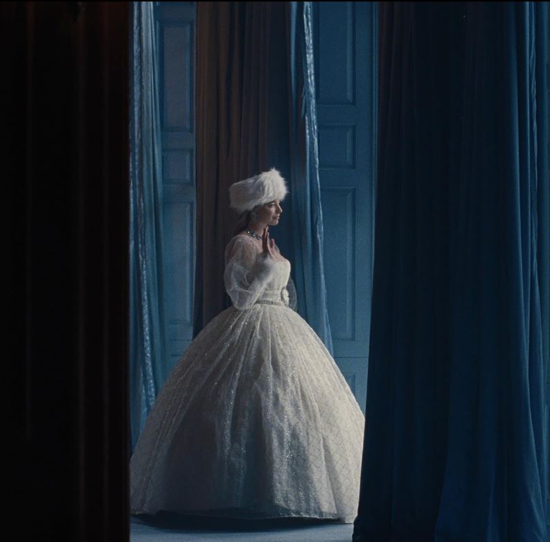
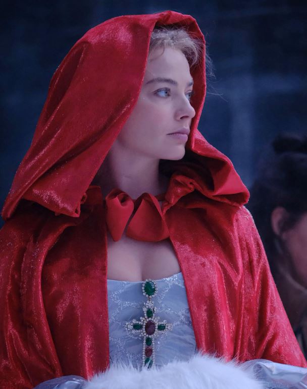
Photo: Courtesy of Warner Bros.
Cathedral Aesthetic
This might be the most gothic look in the entire film. Black dominates completely. It’s dramatic, romantic, and almost devotional. The off-shoulder neckline is sheer and structured at the same time, with the dark translucent veil moving in the wind like smoke. The crosses, which appear in multiple looks throughout the film, become especially powerful here.
Cross motifs in fashion trace back to medieval ecclesiastical dress, Victorian mourning jewelry, and later gothic revival aesthetics, where religion, grief, obsession and beauty collapse into one visual code. The kiss through the black tulle was almost unreal. This is the kind of scene people will screenshot, loop, repost, and refuse to emotionally recover from.
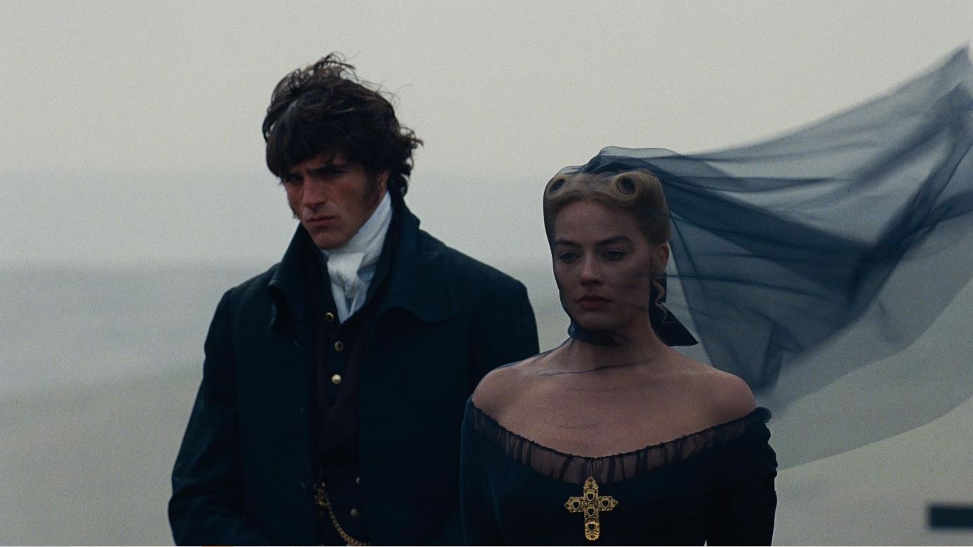
Photo: Courtesy of Warner Bros.
Beauty as Script
Hair and makeup designer Siân Miller, who built 35–40 hairstyles for Margot’s Cathy, treated blush, freckles, wigs, ribbons, and jewels as narrative devices. Nothing here is “pretty for the sake of pretty.” Every texture, every placement, every shift in color reads like a line of dialogue. This film is basically a gift to beauty analysts, because the hair and makeup department explains their system almost like a dramaturgy.
Photo: Courtesy of Warner Bros.
Flush of Life
What viewers remember instantly is the unified blush across the entire cast, including the men. The team explains the “weather” concept: on the territory of Wuthering Heights, everyone should look wind-beaten, slightly raw, as if the moors are physically touching their faces. For Cathy, the visual starting point was the “pomegranate girl” aesthetic. That juicy, just-bitten, almost fruit-stained red. But it doesn’t stay static. Depending on the emotional temperature of the scene, the shade shifts from deep burgundy to muted mauve.
Photo: Courtesy of Warner Bros.
The blush is pulled slightly downward. It creates that natural, slightly awkward, almost feverish flush that reads as a bodily reaction. There’s been a wave of Victorian Gothic films lately, Dracula, Frankenstein, and now Wuthering Heights. Across all of them, this specific blush aesthetic keeps showing up. And it feels like it’s about to replace the lifted, bronzed, sculpted makeup we’ve been stuck on for years.
The department was obsessive about continuity. They describe using custom freckle masks and airbrush techniques to ensure Cathy’s freckles matched perfectly between her younger and older versions and stayed consistent from scene to scene.
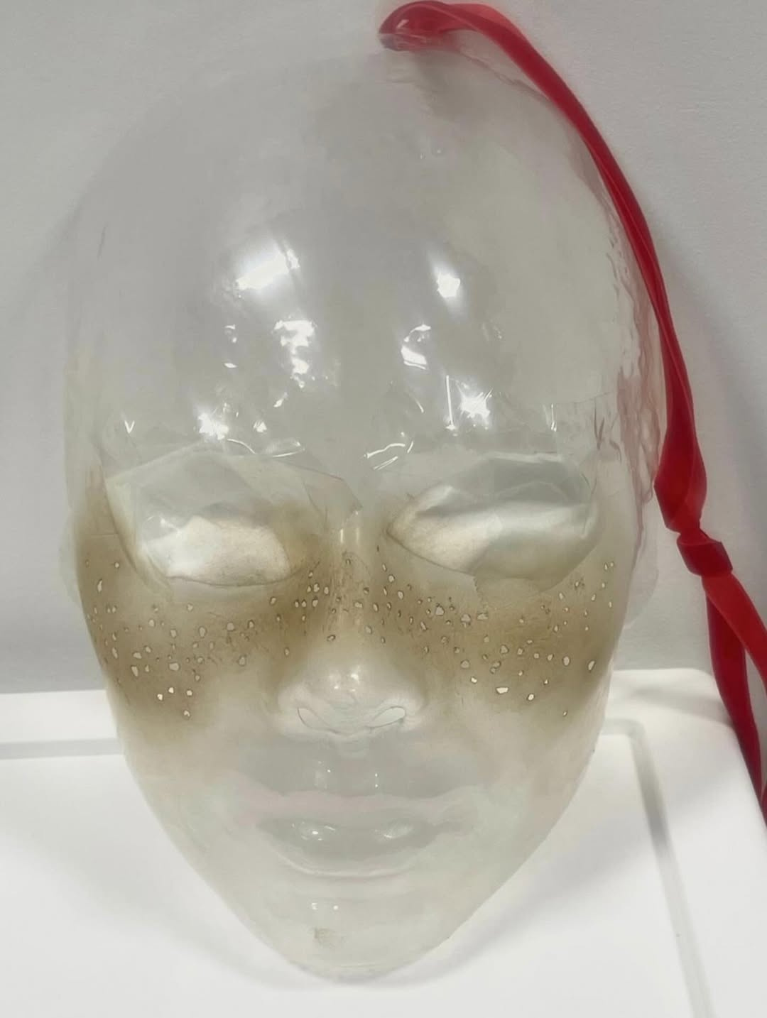
Photo: Courtesy of Warner Bros.
Braids & Horns
The most valuable part is that many of the hairstyles are openly described as symbols. Remember, earlier we talked about the constructor method? Here it’s fully activated. Siân Miller literally says she wanted the hair system to work “like LEGO,” so that wigs and pieces could be swapped quickly to create many looks.
There are the doll braids, two plaits laced together with red ribbon like a corset. Within the story, Isabella styles her that way because she sees Cathy as something decorative, almost like a doll to be dressed. Another layer to this motif: in earlier scenes Cathy’s corset is laced at the front, because she has no maid. Later, in her more luxurious life, everything is laced at the back. The hair mirrors that social shift.
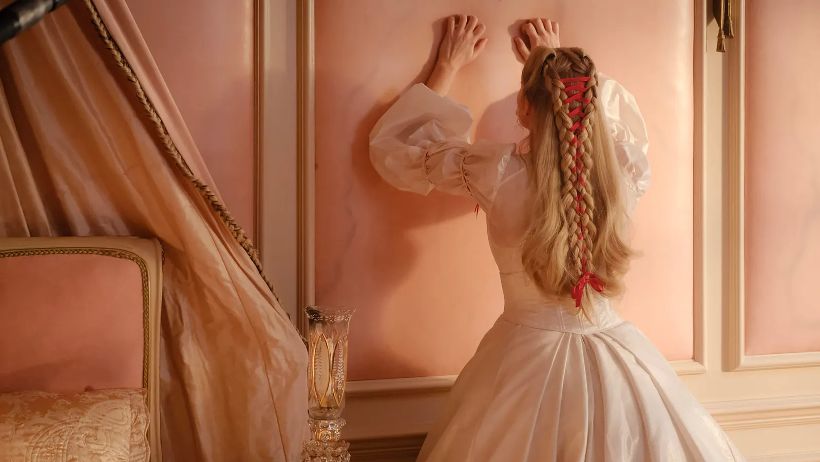
Photo: Courtesy of Warner Bros.
Another perfect example is the wedding scene. You barely see the hair because of the veil, but underneath, there’s a lattice braid structure with stones literally glued in place. It’s explained as a cage. She’s walking into a marriage she doesn’t want, and the hairstyle quietly says that before the script does.
There’s also a sharper axis of growth with the “horns,” a variation of victory rolls. In interviews, they’re described both as a nod to devilish behaviour and as a kind of crown effect.
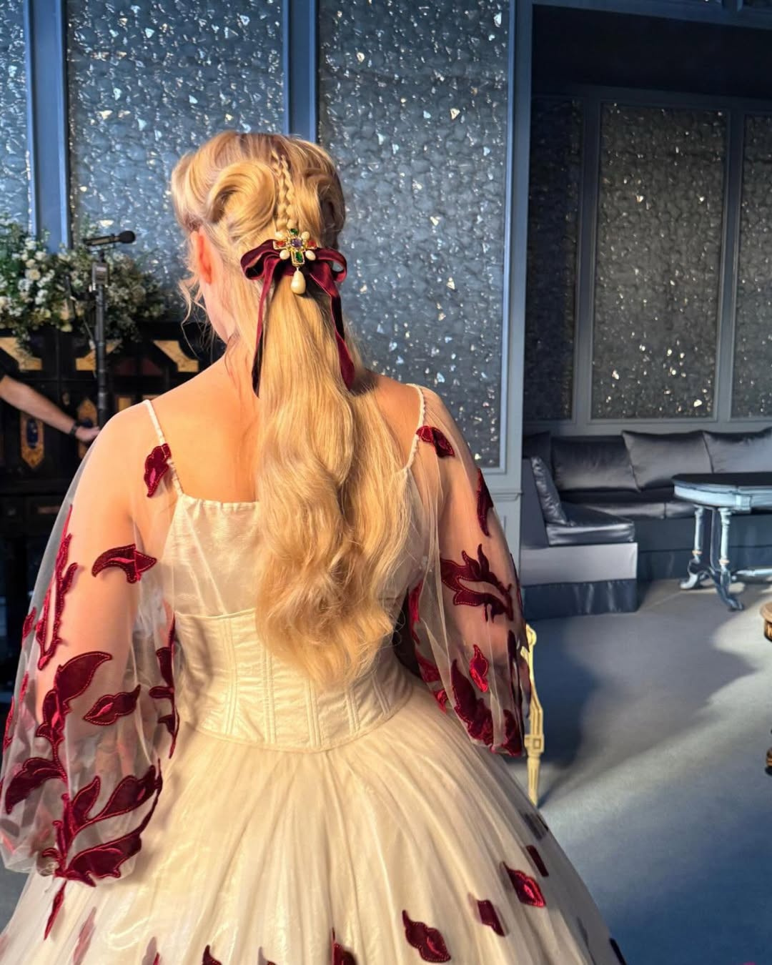
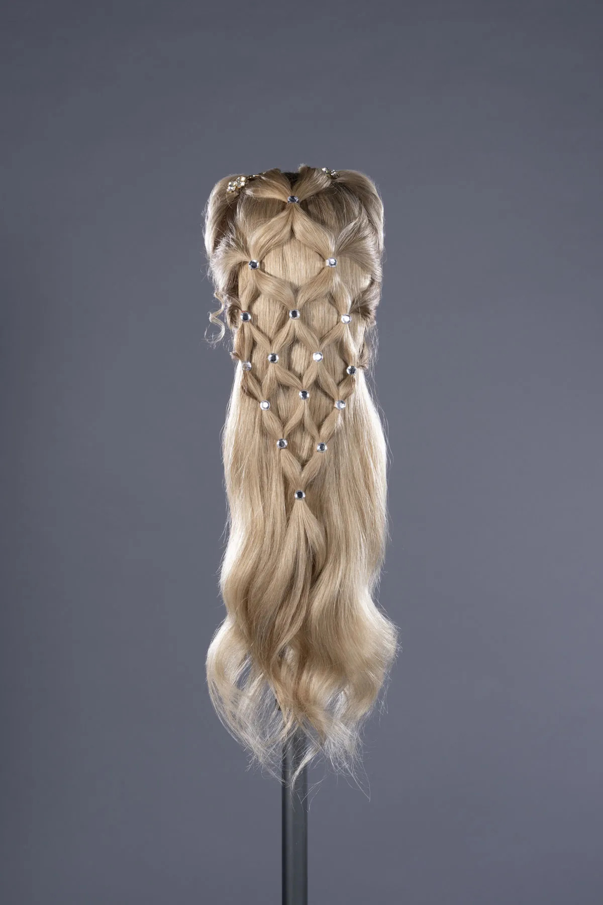
Photo: Courtesy of Warner Bros.
Victorian Euphoria
Before marriage, at Wuthering Heights, Cathy wears almost nothing decorative. But inside Linton’s house, that modesty disappears. Crystals begin to appear on her face, graphic accents shape the eyes, small art-driven details, and dreamy and fancy makeup looks enter the frame.
The jewels, the structured hair, the ornamental makeup read as her only available entertainment. Beautiful things become a distraction. The more decorative she looks, the clearer it becomes that she is profoundly bored.
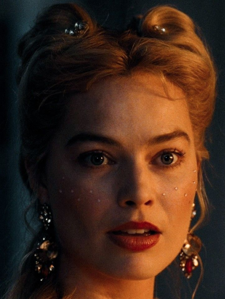

Photo: Courtesy of Warner Bros.
Heathcliff, The Man You Are
Heathcliff’s styling moves through two very clear phases. In the beginning, the direction was to let everything grow. Longer hair, extended with a custom wig, dirt physically worked into the skin, visible scars, traces of labour and exposure. He looks unpolished, almost feral, shaped by the landscape.
Then comes the shift. The internet has already branded it the “Darcy Elordi” era, and the name stuck for a reason. The hair tightens into a regency cut. The wardrobe leans into Georgian references, though not in a strict historical sense. Dark coats, brooding palettes, crisp white shirts, that long black silhouette that reads Byronic instantly. Add the gold tooth and the subtle earring detail, and suddenly it’s not just period romance, it’s character branding. The earring especially sent TikTok into mild chaos. Fan edits multiplied x10.
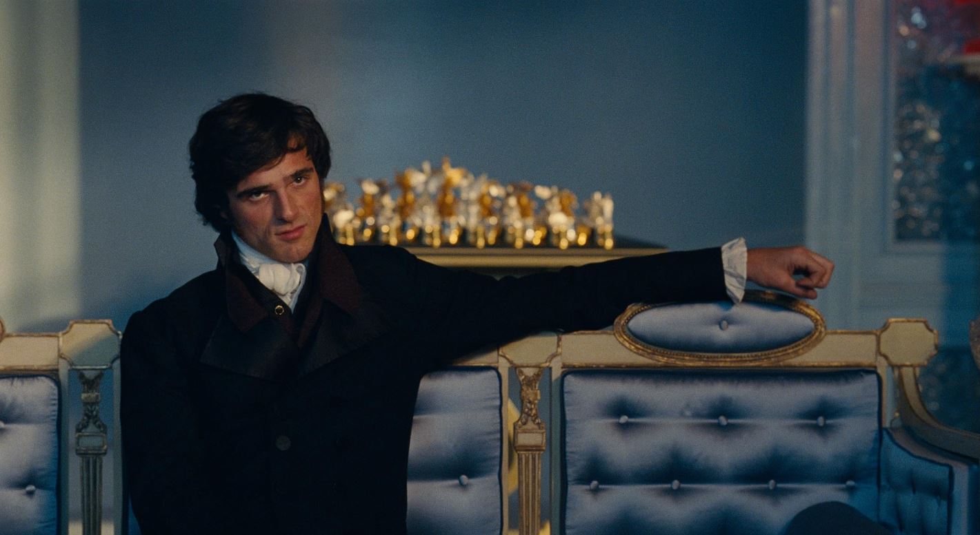
Photo: Courtesy of Warner Bros.
Decor Inspo
Production designer Suzie Davies built two completely separate visual universes on one giant soundstage: Wuthering Heights and Thrushcross Grange. And instead of playing it safe, she pushed every surface into something glossy, tactile, even sweaty. We’re skipping the obvious leather-room discourse and the chess-floor symbolism. Let’s talk about the details that quietly hijacked the frame.
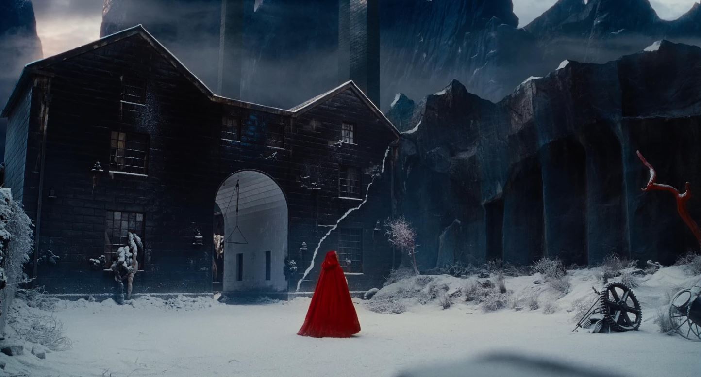
Photo: Courtesy of Warner Bros.
Outside, the garden terrace at the Grange is pure rich-people-weirdness in the best way. From the fountain mouths, instead of water, pearl necklaces spill down. Davies has said water felt “too traditional,” so pearls replaced it. Nearby, giant clear glass vases hold actual goldfish, and honestly, it’s an easy celebration steal.
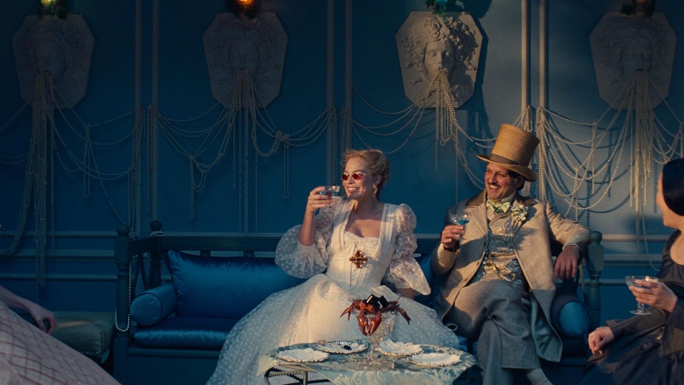
Photo: Courtesy of Warner Bros.
The script literally called for the dollhouse, and Davies has framed it as central to Fennell’s vision of the story. The miniature Grange sits in the dining room like a visual thesis. Fans describe it as a metaphor for miniaturization: Cathy as Alice, the house as both too large and too small at once. Everything exists in miniature, which makes it feel staged, slightly trapped. For weddings, that translates easily. Scale something down and play with proportion. For example, make a hyper-detailed miniature of your venue.
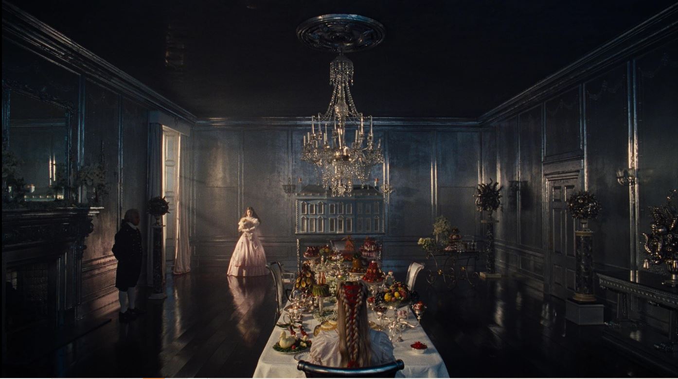
Photo: Courtesy of Warner Bros.
The friendship scrapbook is real discourse, and our “hear me out.” In social content, fans keep bringing up the pop-up scrapbook Isabella gifts Cathy, staged as this hilariously awkward, obsessive archive of their bond, but the idea is too good to ignore. Swap the traditional guestbook for a scrapbook station. Let friends leave collages, chaotic drawings, inside jokes, memes, not just “Best wishes.” It’s DIY, it’s personal, and it feels very 2026-coded.
Photo: Courtesy of Warner Bros.
Off-Screen Details
The story didn’t stop when the credits rolled. The premieres turned into an extension of the film’s universe, packed with easter eggs, references, and hyper-specific details that felt just as intentional as anything on screen. A separate, very loud thank you goes to Margot Robbie’s stylist Andrew Mukamal, whose red carpet direction didn’t dilute the character but elevated it. The looks felt like a continuation of the story.
So before we zoom into Brontë-coded details, let’s take one collective second to appreciate the height difference between Jacob Elordi and Margot Robbie, as we all deserve it.
Photo: Warner Bros. Australia
Initials in 14K
At the Sydney premiere, the gold tooth returned. Jacob wore a 14-karat gold tooth cap by Maison Raksha, set with tiny star diamonds and engraved with “C + H,” directly referencing Catherine and Heathcliff. It mirrored the gold tooth in the film, turning the red carpet into a character in its own right. Initials and symbols don’t have to live only on rings: micro-engravings, hidden details, unexpected placements.
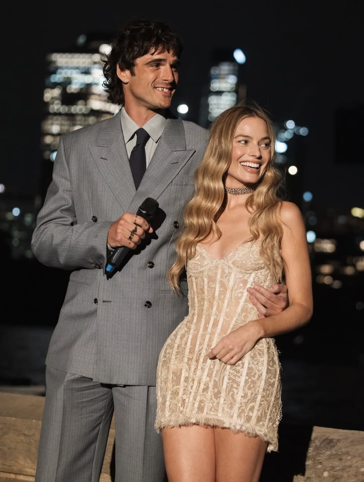
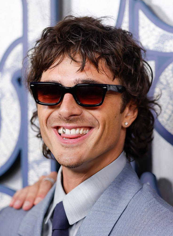
Photo: Warner Bros. UK, Getty Images
Woven Sentiments
At the London premiere, Margot wore custom Dilara Findikoglu corsetry, but the real conversation piece was the bracelet. It was a replica of “The Bracelet of Charlotte,” created in collaboration with The Brontë Parsonage Museum. The original is Victorian mourning jewelry owned by Charlotte Brontë, woven from the hair of Emily and Anne.
Hair-woven jewelry was common in the 1800s, often incorporating human hair with stones like garnet or onyx. For modern bridal thinking, you don’t have to lean into mourning. It’s a reminder that sentiment can be constructed, commissioned, translated. Make sentiment wearable.
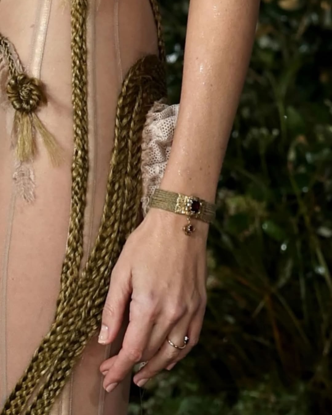
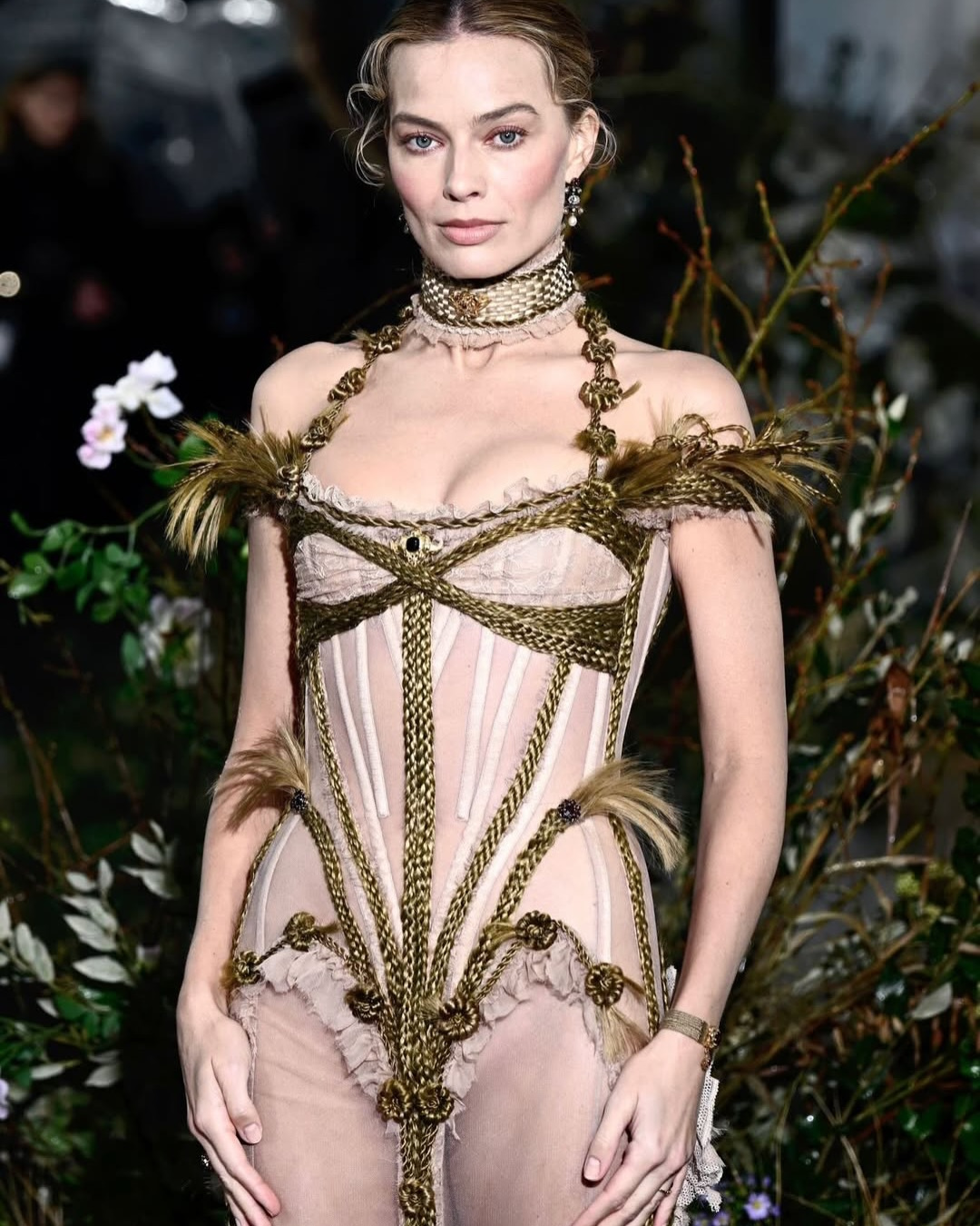
Photo: Andrew Mukamal
Whatever Our Souls Are Made Of
Margot gifted Jacob a signet set by Cece Jewellery, designed by Cece Fein-Hughes. Two hand-enameled skulls embracing, thorns, a Brontë quote engraved inside: “Whatever our souls are made of, his and mine are the same.” The characters’ initials. “1847–2026.” Personal, narrative-driven, wearable forever.
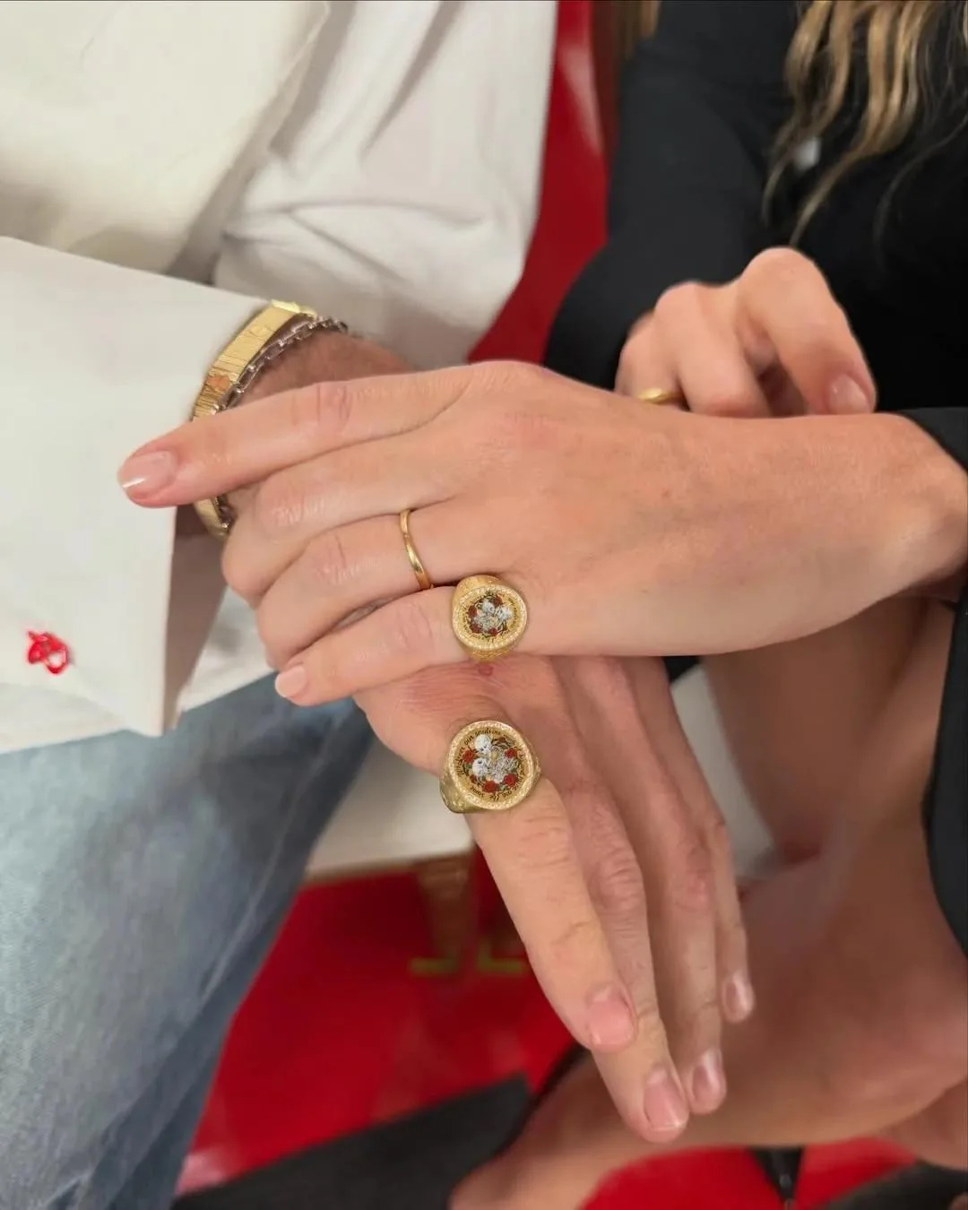
Photo: Pati Dubroff, Cece Jewellery