Wedding stationery is often the first moment your guests feel the mood of your celebration, so it helps when every piece reflects something real about your style. Signage then carries that feeling through the day, guiding your people with clarity, adding small surprises, and shaping the atmosphere in ways you might not expect. In this article, you’ll find a range of styles couples love right now, whether you’re imagining moody gothic details, soft watercolor layers, vintage lace textures, modern shapes, or something playful and bright. Each direction gives you ideas that help your stationery feel connected to your story and visually striking from the very first glance.
Whimsical and playful stationery is a burst of personality that instantly tells guests your celebration won’t follow the usual script. Nothing here is too perfect, and that’s the charm. Shapes drift away from the standard rectangle, colors are brighter, and typography moves with an artistic rhythm. Illustrated maps, cutout silhouettes, layered pieces, and unexpected materials create a sense of movement that keeps the eye exploring. This style works beautifully for couples who enjoy a touch of creative messiness and want expressive paper goods with small, memorable surprises.
Minimalistic stationery and signage thrives on clarity and intention. Every element has a purpose, and nothing competes for attention. Clean layouts, soft neutrals, and high-quality paper create a quiet confidence that works beautifully across any wedding style. Typography usually takes the lead here, whether it’s a refined serif or a crisp sans-serif with generous spacing. Subtle embossing, blind deboss, or a single metallic accent can add depth without disrupting the simplicity. This direction suits couples who appreciate understatement, polished details, and a modern sense of order that still reads as warm and inviting.
If you prefer paper goods that move away from templates and cliché moments, watercolor fine art offers a truly one-of-a-kind direction. Soft washes, blurred transitions, and painterly layers bring a quiet elegance that never looks repetitive. Handmade paper, deckled edges, and loose illustrations add depth without overpowering the design, echoing landscapes, florals, or architectural lines. This style works beautifully for couples who want artistry, subtle transitions, and stationery with a distinctive, hand-touched character.
Modern geometric stationery leans into sharp thinking and clean structure, using shape as the main storyteller. Angles shift, lines break in unexpected places, and proportions play against each other in a way that instantly changes the mood of the layout. Stacked layers, precise cutouts, and bold typographic blocks often behave more like graphic posters than traditional paper goods. Color can stay neutral or shift into confident accents, but the composition always leads.
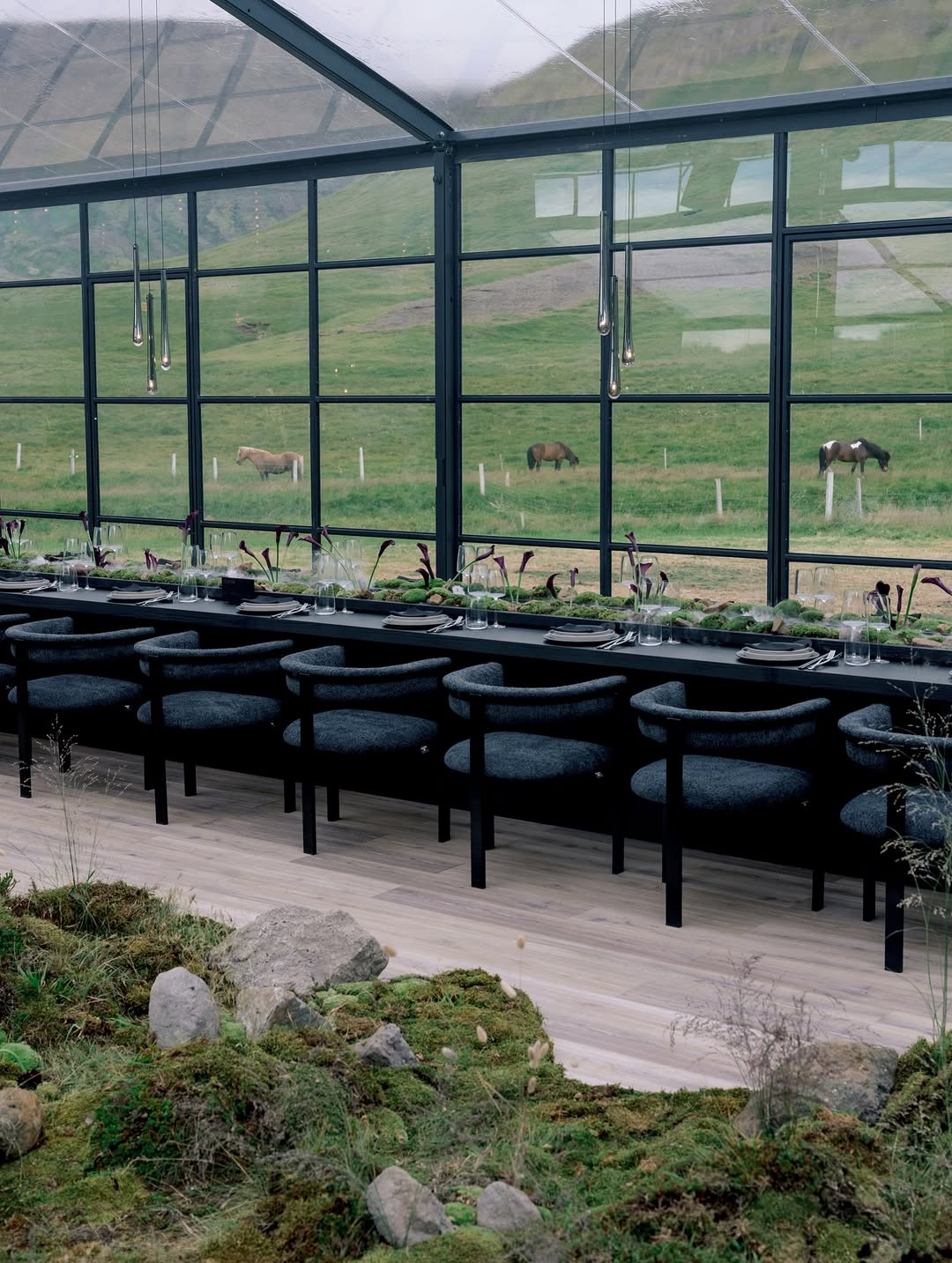
Rustic stationery and signage starts with the material itself, because the base is what sets the tone. Leather textures, woven elements, wood grains, linen, and cotton paper with visible fibers create a natural, grounded foundation. Designs usually stay simple and well-considered to let those surfaces speak on their own. Warm tones, quiet typography, and soft botanical touches help the suite connect with the wider wedding aesthetic. Torn edges or watercolor greenery can appear, but always with restraint. The result is an organic, tactile look where materials are not just a backdrop but a key part of the design.
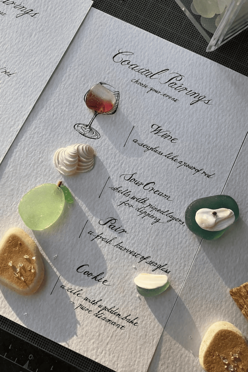
Coastal stationery isn’t limited to the usual pale blues, so don’t hesitate to step outside that palette. Sandy neutrals, soft greens, weathered wood tones, and shell-inspired whites work beautifully and often feel more natural to the setting. Textured paper, subtle grain patterns, and translucent layers can echo light, movement, and shoreline details without leaning into theme-y territory. Small elements like rope-inspired lines, pressed shells, or watercolor horizons add coastal character. This approach keeps the suite airy and grounded, with a quiet nod to the sea rather than a literal interpretation.
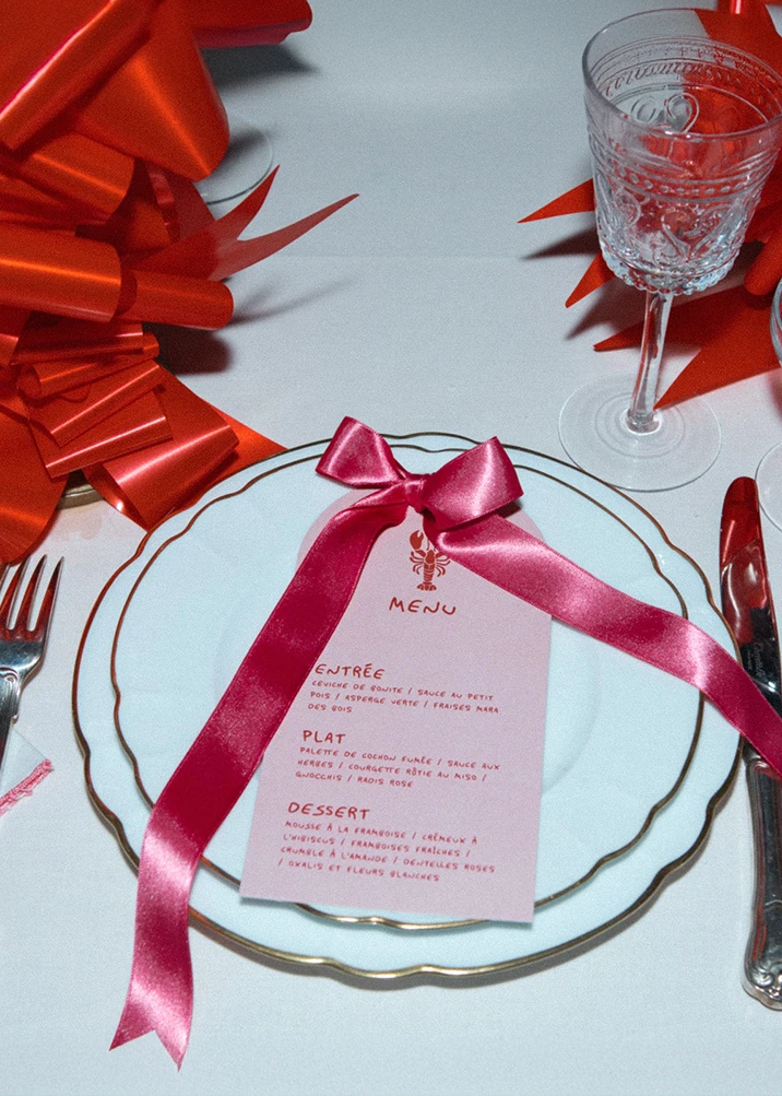
Gothic stationery today is less about theatrics and more about rich, moody elegance. Deep black, plum, and cherry-red tones anchor the palette, while materials like velvet, sheer tulle, and mirrored acrylic add weight and dimension. Typography tends to be sharp and sculptural, often paired with minimal ornamentation to keep the look elevated. Wax seals, etched details, and deckled edges introduce texture without overwhelming the composition. The combination of dark surfaces, reflective elements, and tactile fabrics creates a dramatic, modern atmosphere that reads confidently and unmistakably gothic.
Vintage romance is having a moment, and stationery is one of the easiest places to bring that trend into your day. Lace overlays, crochet-inspired patterns, and textured cotton paper introduce a soft, time-touched quality that instantly stands out. Vintage stamps, black-and-white photographs, and delicate script add a collectible charm, almost like pieces curated from an old keepsake box. If your vision leans toward nostalgia and handcrafted details, this direction will land beautifully.
Regency-inspired stationery loves ornament, but in a polished, curated way. Architectural borders, baroque flourishes, and mural-style artwork instantly set a grand, historic tone, especially when paired with gold detailing or cameo motifs. Envelope liners echo palace ceilings, while shaped cards mimic antique frames with their soft curves and raised edges. Velvet, satin ribbon ties, and embossed crests add texture that feels ceremonial rather than heavy. Color can swing from powdered pastels to deep jewel tones, depending on your mood. If you’re drawn to lavish detailing and a touch of old-world theatre, this aesthetic brings that world onto paper effortlessly.
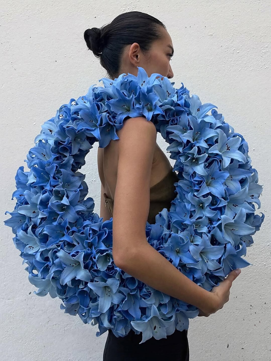
Floral-inspired stationery goes far beyond classic blooms. Illustration style, texture, and composition play a bigger role than color, which is why this direction works beautifully even for couples who prefer a softer palette. Loose watercolor botanicals and fine-line drawings add gentle movement, while fuller garden motifs create a richer moment on the page. Embossed floral patterns are a standout option when you want dimension without introducing bold shades, and they pair easily with other styles in your suite. Floral liners, pressed petals, or small botanical accents can finish the look with a modern, refined touch.
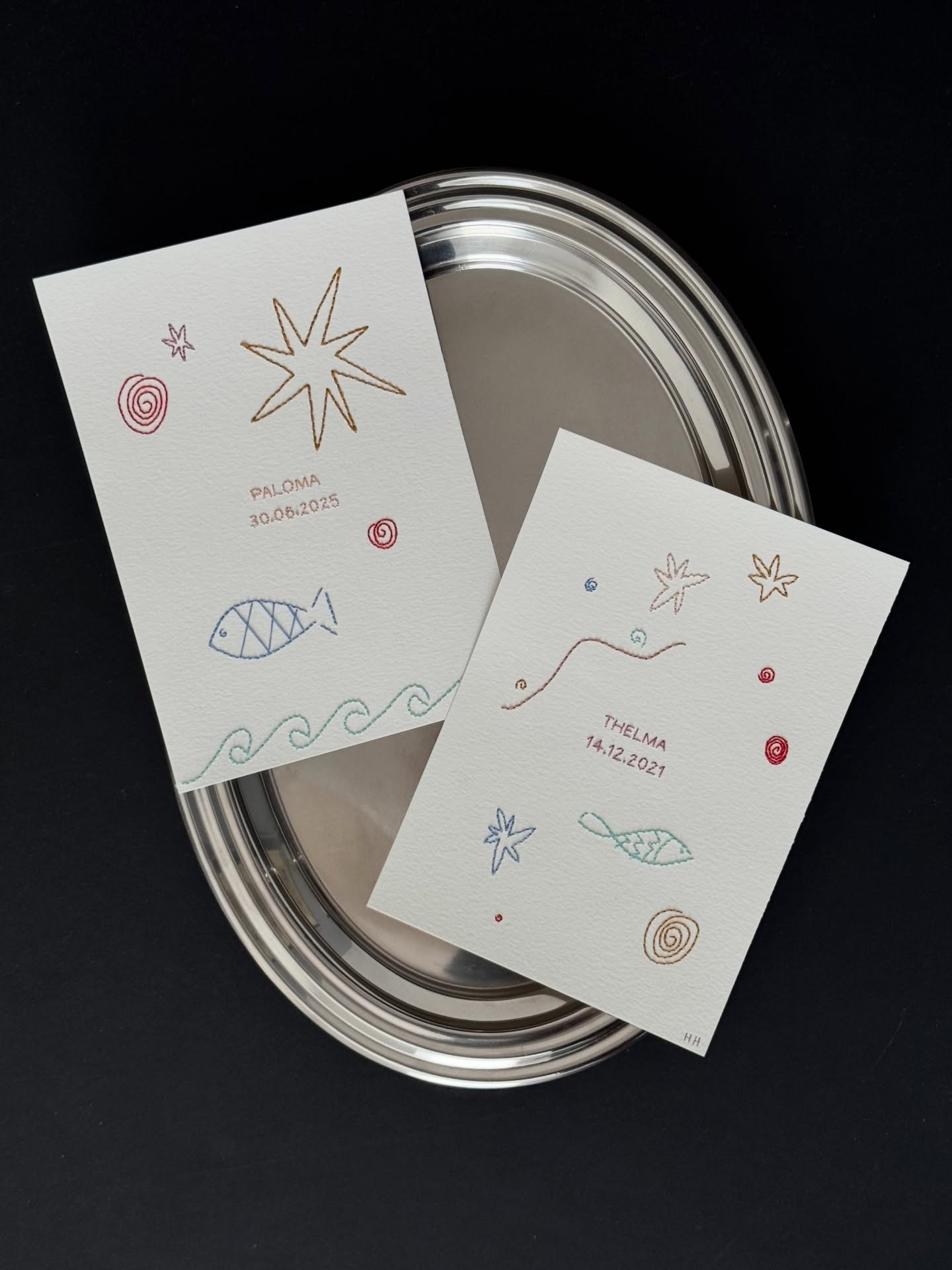
Celestial stationery and signage brings in a little magic for sure. Suns, moons, and orbit-inspired shapes open the door to round formats, clever cutouts, and layered pieces that move or reveal hidden details. Gold foil works beautifully here, but deep black backgrounds, soft gradients, and thin astronomical lines can be just as striking. Textured paper keeps everything grounded, while metallic touches add a quiet glow. You can go bold with a sunburst moment or stay subtle with an embossed crescent. It’s a playful, graphic option if you want something a little cosmic and unmistakably romantic.